# uncomment to install or upgrade cityseer
# !pip install --upgrade cityseerComputing Accessibilities
Accessibility analysis measures how easily people can reach specific destinations (schools, parks, healthcare, shops) from any point in a city’s street network. Here we’ll use cityseer to compute these measures for Madrid.
Under-The-Hood
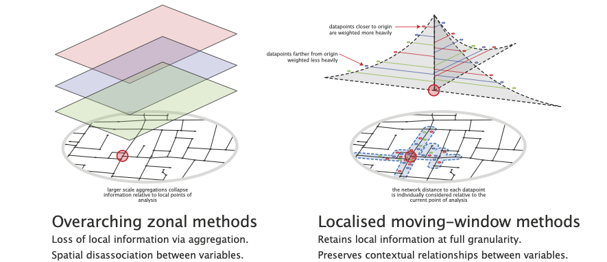
Basic accessibilities can be computed directly in a tool like QGIS by buffering a point of analysis and counting the number of target locations falling within the buffer. This is the approach used when calculating the Walkability Index, in which case we want to assess the number of intersections or transportation stops within a certain distance of each street intersection.
These approaches can work surprisingly well, but it is sometimes preferable to have greater precision, especially when working at a granular scale of analysis: a landuse can suddenly seem much farther away when it is on the opposite side of a large block, or when running into a barrier such as a river, motorway, or railway line. In these cases, we can be more precise about how landuses are assigned to streets, how distances are measured over the network, and how contributions are weighted by distance. While more complex, the underlying idea remains the same: we’re quantifying spatial access to “something”.
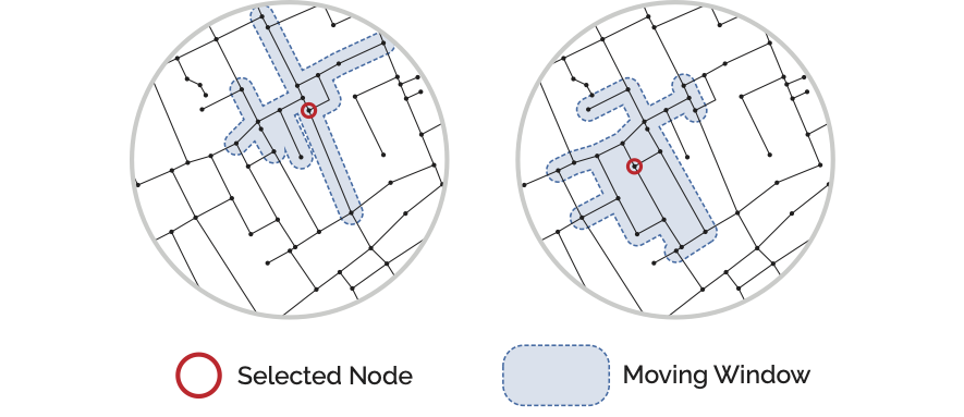
In the Network Analysis lesson the concept of a “moving window” form of spatial analysis was introduced. This approach works by figuring out which other street network nodes are within a specified distance from a source node (the current point of analysis) given distances measured over the street network. This “inverts” how we look at space: instead of looking from the outside-in we are now quantifying from the inside-out, i.e. we are adopting a pedestrian’s perspective of locations and distances.
Once computed, we know which other streets can be reached within a certain distance from any given point of analysis. However, we also need to know which street a particular landuse is associated with. For point data, this is achieved with a winding algorithm: from each landuse location, an algorithm looks for the closest street network node and then “circles the block” to identify the closest adjacent street edge. The landuse is then assigned to the nodes on either side of this street so that the algorithms which measure distances can subsequently use either direction of approach when determining whether a landuse can be reached from the current point of analysis.
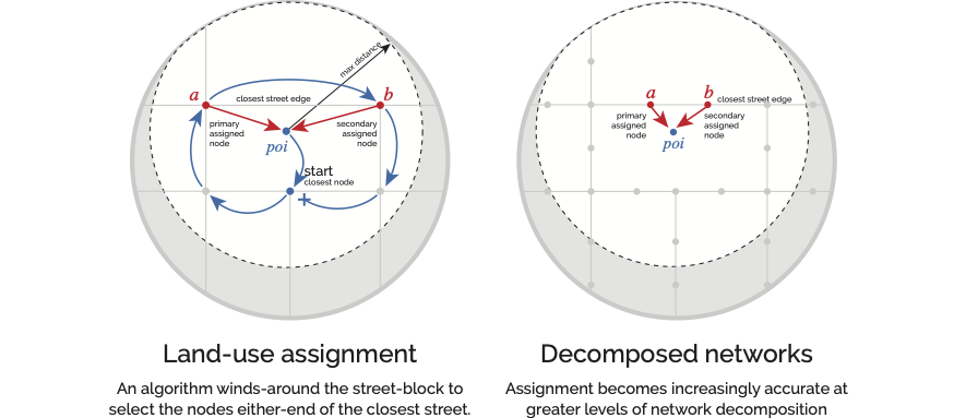
To increase precision further, you can use network decomposition: chopping the network into smaller pieces to tease out variances along street segments.
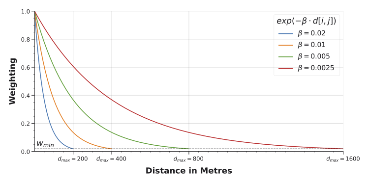
Because moving windows calculate distances from each point of analysis to each reachable landuse individually, we can weight their contributions by distance so that closer locations count more than farther ones.
NoteAdapting This Workflow
The workflow below (load network, load points of interest, prepare the network, compute accessibilities, visualise) is a template. The specifics (Madrid’s streets, the premises dataset, the landuse categories) can generally be swapped out for any street network and any point of interest dataset. If you have a street network and a set of locations you care about, the same code will typically work with some minor modifications to match the dataset particularities. Additional examples are available on the Cityseer examples site.
Computing Accessibility
The steps described above (windowing, landuse assignment, distance weighting) are handled by cityseer automatically. The code below walks through a complete example using Madrid’s premises data.
Import the required packages.
import geopandas as gpd
import matplotlib.pyplot as plt
from cityseer.metrics import layers
from cityseer.tools import graphs, io
Download the Street Network, Madrid Premises, and Boundary for Madrid. Update the file paths as necessary.
# load the streets - update the file path as needed
mad_net = gpd.read_file("../../data/madrid_streets/street_network.gpkg")

mad_net.head()| clased | nombre | geometry | |
|---|---|---|---|
| 0 | Autopista libre / autovía | M-406 | LINESTRING (437440 4460857, 437460 4460868, 43... |
| 1 | Carretera convencional | M-406 | LINESTRING (437438 4460861, 437472 4460878) |
| 2 | Urbano | FUERZAS ARMADAS (DE LAS) | LINESTRING (438131 4461473, 438133 4461461, 43... |
| 3 | Urbano | FUERZAS ARMADAS (DE LAS) | LINESTRING (438023 4461398, 438058 4461407, 43... |
| 4 | Carretera convencional | M-406 | LINESTRING (438181 4461468, 438177 4461465, 43... |
# load the premises - update the file path as needed
mad_prems = gpd.read_file("../../data/madrid_premises/madrid_premises.gpkg")

mad_prems.head()| index | local_id | local_distr_id | local_distr_desc | local_neighb_id | local_neighb_desc | local_neighb_code | local_census_section_id | local_census_section_desc | section_id | section_desc | division_id | division_desc | epigraph_id | epigraph_desc | easting | northing | geometry | |
|---|---|---|---|---|---|---|---|---|---|---|---|---|---|---|---|---|---|---|
| 0 | 0 | 10003324 | 1 | CENTRO | 105 | UNIVERSIDAD | 5 | 1091 | 91 | I | hospitality | 56 | food_bev | 561001 | RESTAURANTE | 440181.6 | 4475586.5 | POINT (440181.6 4475586.5) |
| 1 | 1 | 10003330 | 1 | CENTRO | 105 | UNIVERSIDAD | 5 | 1115 | 115 | R | art_rec_entert | 90 | creat_entert | 900003 | TEATRO Y ACTIVIDADES ESCENICAS REALIZADAS EN D... | 440000.6 | 4474761.5 | POINT (440000.6 4474761.5) |
| 2 | 2 | 10003356 | 1 | CENTRO | 104 | JUSTICIA | 4 | 1074 | 74 | I | hospitality | 56 | food_bev | 561004 | BAR RESTAURANTE | 440618.6 | 4474692.5 | POINT (440618.6 4474692.5) |
| 3 | 3 | 10003364 | 1 | CENTRO | 104 | JUSTICIA | 4 | 1075 | 75 | G | wholesale_retail_motor | 47 | retail | 472401 | COMERCIO AL POR MENOR DE PAN Y PRODUCTOS DE PA... | 440666.6 | 4474909.5 | POINT (440666.6 4474909.5) |
| 4 | 4 | 10003367 | 1 | CENTRO | 106 | SOL | 6 | 1119 | 119 | G | wholesale_retail_motor | 47 | retail | 477701 | COMERCIO AL POR MENOR DE JOYAS, RELOJERIA Y BI... | 440378.6 | 4474380.5 | POINT (440378.6 4474380.5) |
Before computing accessibilities, it’s worth understanding what’s in the dataset. The describe() and unique() Pandas methods are useful for this; try to get into the habit of using them to explore datasets.
# to describe a column
mad_prems["division_desc"].describe()
count 117358
unique 80
top retail
freq 39680
Name: division_desc, dtype: object# to check for unique values
mad_prems["section_desc"].unique()<StringArray>
[ 'hospitality', 'art_rec_entert',
'wholesale_retail_motor', 'other',
'education', 'real_estate',
'health_social', 'manufact',
'water_sewage', 'info_services',
'finance', 'proffes_science_technic',
'admin_support', 'transport_storage',
'construction', 'public_services',
'elect_util', 'foreign',
'agric_forest_fish', 'resource_extract']
Length: 20, dtype: strFinding Landuses
The division_desc column contains landuse categories. These can be used to filter for specific types. For example, to visualise education locations:
# this sets up the figure and axis
fig, ax = plt.subplots(figsize=(8, 8))
fig.set_facecolor("#111")

# add the street network to the plot for context
mad_net.plot(color="#ddd", linewidth=0.5, ax=ax)

# create a True / False index of premises rows containing 'education'
edu_idx = mad_prems["division_desc"] == "education"

# filter the premises dataset using edu_idx and visualise
mad_prems[edu_idx].plot(
    column="division_desc",
    markersize=20,
    color="red",
    edgecolor="white",
    legend=True,
    ax=ax,
)

# set the axis limits
ax.set_xlim(438000, 440000 + 2500)
ax.set_ylim(4473000, 4475000 + 2500)
# turn off the axis
ax.axis(False)
/tmp/ipykernel_3116/2665157239.py:12: UserWarning: Only specify one of 'column' or 'color'. Using 'color'.
mad_prems[edu_idx].plot((np.float64(438000.0),
np.float64(442500.0),
np.float64(4473000.0),
np.float64(4477500.0))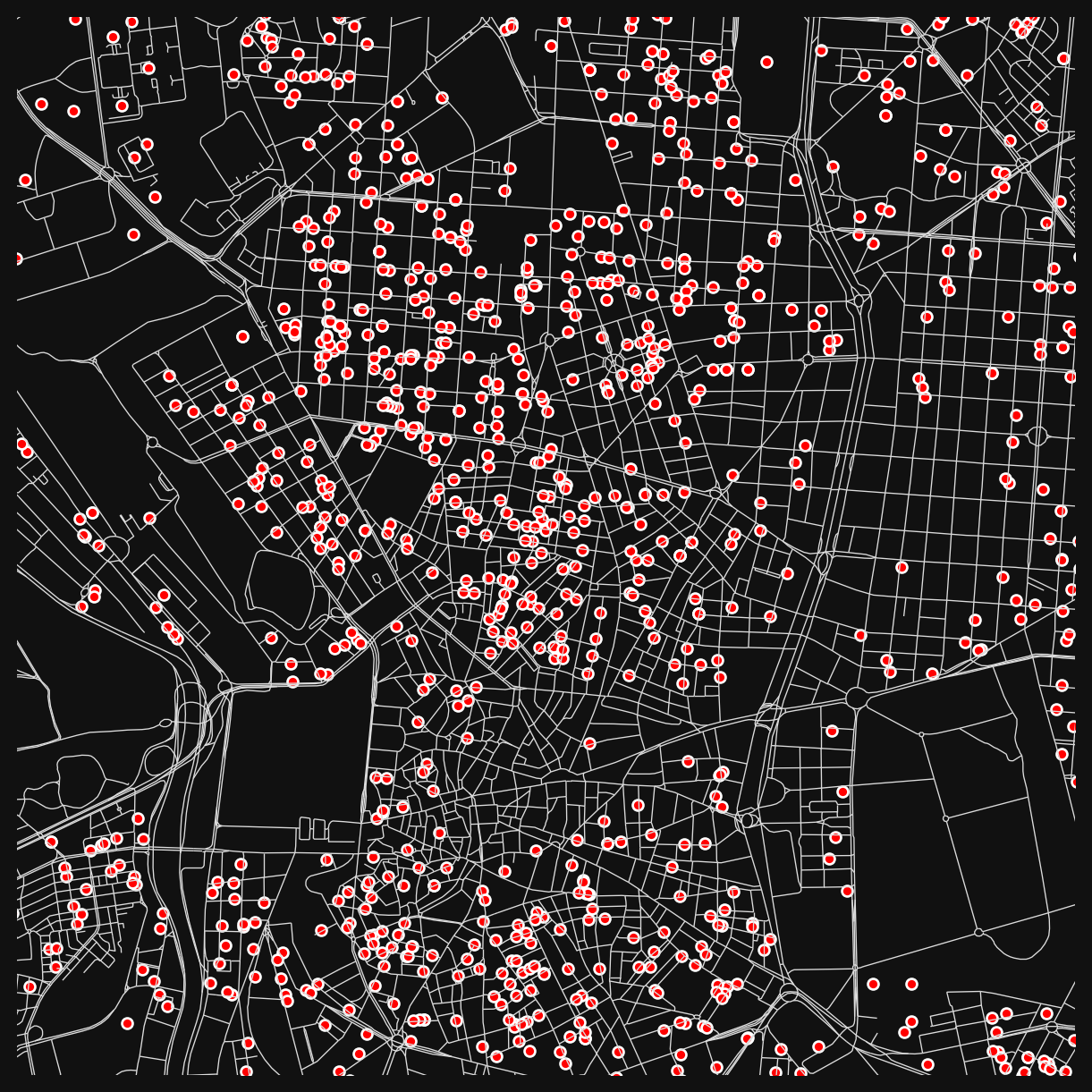
Preparing the Street Network
Network preparation follows the same approach as the centrality lesson:
# cityseer expects single-part geometries
mad_net = mad_net.explode().reset_index(drop=True)

# convert from geopandas to networkX
mad_net_nx = io.nx_from_generic_geopandas(mad_net)

# convert the network to its dual representation
mad_net_dual_nx = graphs.nx_to_dual(mad_net_nx)
INFO:cityseer.tools.graphs:Merging parallel edges within buffer of 1.
INFO:cityseer.tools.graphs:Converting graph to dual.
INFO:cityseer.tools.graphs:Preparing dual nodes
INFO:cityseer.tools.graphs:Preparing dual edges (splitting and welding geoms)As in the centrality lesson, set live=True for nodes inside a boundary to focus the analysis on central Madrid while keeping the surrounding network as a buffer for routing.
from shapely.geometry import Point

# load the boundary
boundary_gdf = gpd.read_file("../../data/bounds_small.gpkg")
boundary_geom = boundary_gdf.union_all()

# set live=True for nodes inside the boundary
for node, data in mad_net_dual_nx.nodes(data=True):
    pt = Point(data["x"], data["y"])
    data["live"] = boundary_geom.contains(pt)

# count live vs buffer nodes
n_live = sum(1 for _, d in mad_net_dual_nx.nodes(data=True) if d.get("live"))
n_total = mad_net_dual_nx.number_of_nodes()
print(f"Live: {n_live}, Buffer: {n_total - n_live}, Total: {n_total}")
Live: 13726, Buffer: 69593, Total: 83319# create a network structure
nodes_gdf, edges_gdf, network_structure = io.network_structure_from_nx(mad_net_dual_nx)INFO:cityseer.tools.io:Preparing node and edge arrays from networkX graph.
INFO:cityseer.graph:Edge R-tree built successfully with 177955 items.Calculating Accessibility
cityseer handles the windowing, landuse assignment, and distance weighting automatically.
# this function will return two variables
# 1 - the input nodes dataframe with new columns added
# 2 - a copy of the landuse geoDataFrame with node assignments added
nodes_gdf, mad_prems = layers.compute_accessibilities(
    # the landuse dataset
    data_gdf=mad_prems,
    # the column denoting landuses
    landuse_column_label="division_desc",
    # the landuse keys to calculate accessibilities for
    # these should match available values in the division_desc column
    accessibility_keys=[
        "education",
        "food_bev",
        "health",
        "creat_entert",
        "sports_rec",
        "Gambling and Betting Activities",
    ],
    # the nodes GeoDataFrame to which the results will be written
    nodes_gdf=nodes_gdf,
    # the optimised network structure for the computations
    network_structure=network_structure,
    # the distances you'd like to compute access for
    distances=[200, 400, 800],
)
INFO:cityseer.metrics.layers:Computing land-use accessibility for: education, food_bev, health, creat_entert, sports_rec, Gambling and Betting Activities
INFO:cityseer.metrics.layers:Assigning data to network.
INFO:cityseer.data:Assigning 117358 data entries to network nodes (max_dist: 100).
INFO:cityseer.data:Finished assigning data. 199768 assignments added to 26587 nodes.
INFO:cityseer.config:Metrics computed for:
INFO:cityseer.config:Distance: 200m, Beta: 0.02, Walking Time: 2.5 minutes.
INFO:cityseer.config:Distance: 400m, Beta: 0.01, Walking Time: 5.0 minutes.
INFO:cityseer.config:Distance: 800m, Beta: 0.005, Walking Time: 10.0 minutes.
Note
We’ll continue in Python, but you could also export the results as a GeoPackage and switch to QGIS from this point onwards.
Let’s explore the newly available columns:
# list the columns
nodes_gdf.columns
Index(['ns_node_idx', 'x', 'y', 'live', 'weight', 'primal_edge',
'primal_edge_node_a', 'primal_edge_node_b', 'primal_edge_idx',
'dual_node', 'cc_education_200_nw', 'cc_education_200_wt',
'cc_education_400_nw', 'cc_education_400_wt', 'cc_education_800_nw',
'cc_education_800_wt', 'cc_education_nearest_max_800',
'cc_food_bev_200_nw', 'cc_food_bev_200_wt', 'cc_food_bev_400_nw',
'cc_food_bev_400_wt', 'cc_food_bev_800_nw', 'cc_food_bev_800_wt',
'cc_food_bev_nearest_max_800', 'cc_health_200_nw', 'cc_health_200_wt',
'cc_health_400_nw', 'cc_health_400_wt', 'cc_health_800_nw',
'cc_health_800_wt', 'cc_health_nearest_max_800',
'cc_creat_entert_200_nw', 'cc_creat_entert_200_wt',
'cc_creat_entert_400_nw', 'cc_creat_entert_400_wt',
'cc_creat_entert_800_nw', 'cc_creat_entert_800_wt',
'cc_creat_entert_nearest_max_800', 'cc_sports_rec_200_nw',
'cc_sports_rec_200_wt', 'cc_sports_rec_400_nw', 'cc_sports_rec_400_wt',
'cc_sports_rec_800_nw', 'cc_sports_rec_800_wt',
'cc_sports_rec_nearest_max_800',
'cc_Gambling and Betting Activities_200_nw',
'cc_Gambling and Betting Activities_200_wt',
'cc_Gambling and Betting Activities_400_nw',
'cc_Gambling and Betting Activities_400_wt',
'cc_Gambling and Betting Activities_800_nw',
'cc_Gambling and Betting Activities_800_wt',
'cc_Gambling and Betting Activities_nearest_max_800'],
dtype='str')nodes_gdf.head()| ns_node_idx | x | y | live | weight | primal_edge | primal_edge_node_a | primal_edge_node_b | primal_edge_idx | dual_node | ... | cc_sports_rec_800_nw | cc_sports_rec_800_wt | cc_sports_rec_nearest_max_800 | cc_Gambling and Betting Activities_200_nw | cc_Gambling and Betting Activities_200_wt | cc_Gambling and Betting Activities_400_nw | cc_Gambling and Betting Activities_400_wt | cc_Gambling and Betting Activities_800_nw | cc_Gambling and Betting Activities_800_wt | cc_Gambling and Betting Activities_nearest_max_800 | |
|---|---|---|---|---|---|---|---|---|---|---|---|---|---|---|---|---|---|---|---|---|---|
| x437440.0-y4460857.0_x437472.0-y4460878.0_k0 | 0 | 437456.843465 | 4.460866e+06 | False | 1 | LINESTRING (437440 4460857, 437460 4460868, 43... | x437440.0-y4460857.0 | x437472.0-y4460878.0 | 0 | POINT (437456.843465 4460866.263906) | ... | 0.0 | 0.0 | NaN | 0.0 | 0.0 | 0.0 | 0.0 | 0.0 | 0.0 | NaN |
| x437399.0-y4460843.0_x437440.0-y4460857.0_k0 | 1 | 437419.500000 | 4.460850e+06 | False | 1 | LINESTRING (437399 4460843, 437440 4460857) | x437440.0-y4460857.0 | x437399.0-y4460843.0 | 0 | POINT (437419.5 4460850) | ... | 0.0 | 0.0 | NaN | 0.0 | 0.0 | 0.0 | 0.0 | 0.0 | 0.0 | NaN |
| x437438.0-y4460861.0_x437472.0-y4460878.0_k0 | 2 | 437455.000000 | 4.460870e+06 | False | 1 | LINESTRING (437438 4460861, 437472 4460878) | x437472.0-y4460878.0 | x437438.0-y4460861.0 | 0 | POINT (437455 4460869.5) | ... | 0.0 | 0.0 | NaN | 0.0 | 0.0 | 0.0 | 0.0 | 0.0 | 0.0 | NaN |
| x437472.0-y4460878.0_x438164.0-y4461448.0_k0 | 3 | 437789.634847 | 4.461205e+06 | False | 1 | LINESTRING (437472 4460878, 437488 4460890, 43... | x437472.0-y4460878.0 | x438164.0-y4461448.0 | 0 | POINT (437789.634847 4461204.897709) | ... | 0.0 | 0.0 | NaN | 0.0 | 0.0 | 0.0 | 0.0 | 0.0 | 0.0 | NaN |
| x437399.0-y4460848.0_x437438.0-y4460861.0_k0 | 4 | 437418.500000 | 4.460854e+06 | False | 1 | LINESTRING (437399 4460848, 437438 4460861) | x437438.0-y4460861.0 | x437399.0-y4460848.0 | 0 | POINT (437418.5 4460854.5) | ... | 0.0 | 0.0 | NaN | 0.0 | 0.0 | 0.0 | 0.0 | 0.0 | 0.0 | NaN |
5 rows × 52 columns
Note the columns added to nodes_gdf. For each landuse in the accessibility_keys list, cityseer produces three types of column at each distance:
| Column pattern | Example | What it measures |
|---|---|---|
cc_[LANDUSE]_[DIST]_nw |
cc_education_200_nw |
Count: how many locations of that type are reachable within the distance. |
cc_[LANDUSE]_[DIST]_wt |
cc_health_800_wt |
Weighted count: same count, but each location’s contribution decays with distance (closer counts more). |
cc_[LANDUSE]_nearest_max_[DIST] |
cc_sports_rec_nearest_max_800 |
Nearest distance: how far to the single closest location, up to the maximum distance. |
These three types answer different questions. The rest of this notebook uses them to explore Madrid’s amenity landscape.
Three lenses on access
Count: “How much choice do I have?”
The unweighted count (_nw) is the simplest measure: how many education locations can a pedestrian reach within 200m? Streets near clusters of schools will score high; streets with one school nearby score 1; streets with none score 0.
fig, ax = plt.subplots(figsize=(8, 8))
fig.set_facecolor("#111")

nodes_gdf.plot(
    "cc_education_200_nw",
    cmap="inferno",
    linewidth=2,
    ax=ax,
)

ax.set_xlim(438000, 440000 + 2500)
ax.set_ylim(4473000, 4475000 + 2500)
ax.axis(False)
(np.float64(438000.0),
np.float64(442500.0),
np.float64(4473000.0),
np.float64(4477500.0))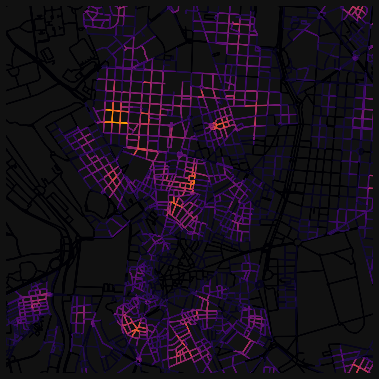
Because these are raw counts, you’ll see hard boundaries where a school falls just inside or just outside the 200m threshold. A street 199m away scores 1; a street 201m away scores 0. That abruptness is a feature of unweighted counts.
Weighted count: “How well-served am I, accounting for walking effort?”
The weighted count (_wt) applies distance decay: a health clinic 100m away contributes more than one 700m away. This produces smooth gradations instead of hard edges, and better reflects the pedestrian experience (closer is genuinely more accessible).
fig, ax = plt.subplots(figsize=(8, 8))
fig.set_facecolor("#111")

nodes_gdf.plot(
    "cc_health_800_wt",
    cmap="viridis",
    linewidth=2,
    ax=ax,
)

ax.set_xlim(438000, 440000 + 2500)
ax.set_ylim(4473000, 4475000 + 2500)
ax.axis(False)
(np.float64(438000.0),
np.float64(442500.0),
np.float64(4473000.0),
np.float64(4477500.0))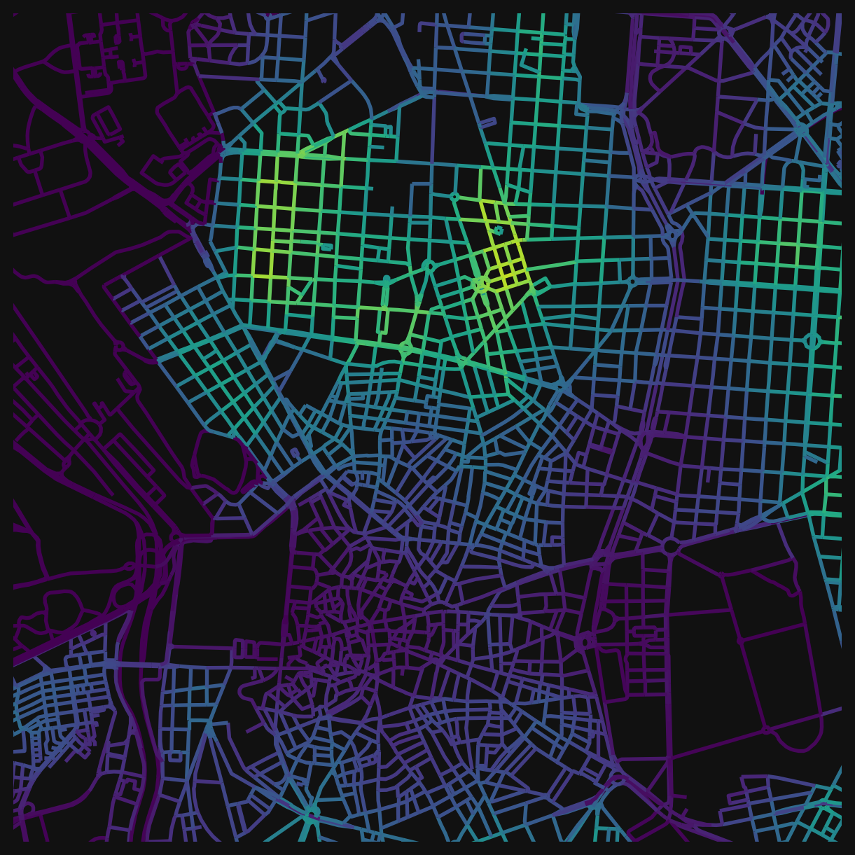
Compare this to the unweighted equivalent (cc_health_800_nw). The weighted version distinguishes between “many clinics nearby” and “many clinics, but all at the edge of the 800m window”.
Nearest distance: “Can I get to at least one?”
Sometimes the question isn’t “how many” but “how far to the closest one”. The _nearest_max_800 columns measure this directly: the network distance to the single nearest location of that type. An inverted colourmap works well since shorter distances are better.
fig, ax = plt.subplots(figsize=(8, 8))
fig.set_facecolor("#111")

nodes_gdf.plot(
    "cc_sports_rec_nearest_max_800",
    cmap="Blues_r",  # add _r to reverse a cmap
    linewidth=2,
    ax=ax,
)

ax.set_xlim(438000, 440000 + 2500)
ax.set_ylim(4473000, 4475000 + 2500)
ax.axis(False)
(np.float64(438000.0),
np.float64(442500.0),
np.float64(4473000.0),
np.float64(4477500.0))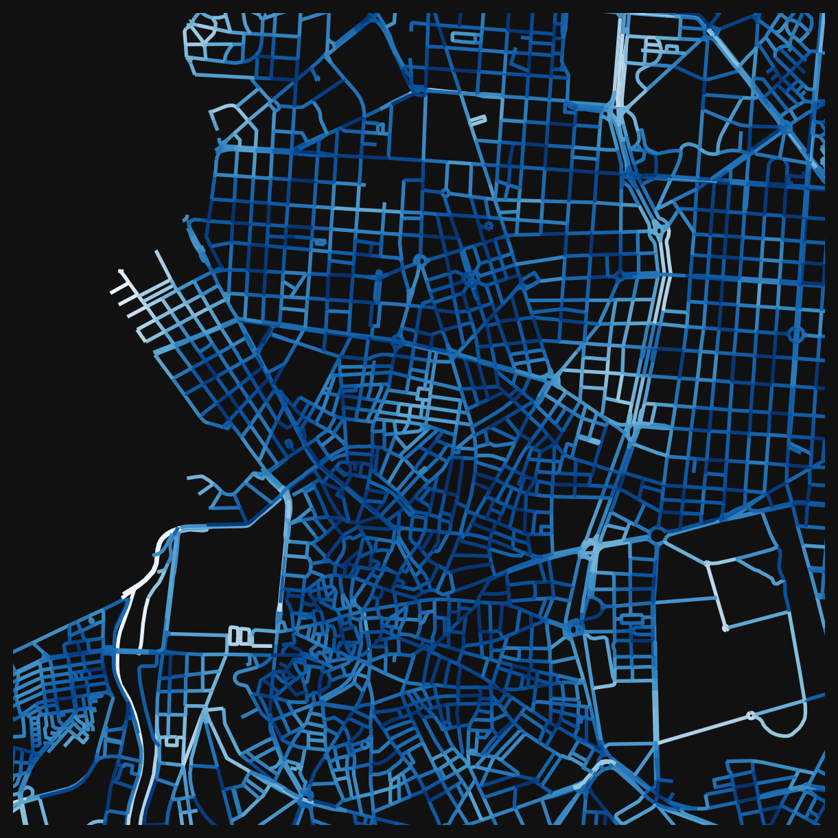
This is useful for coverage questions: is there at least one sports facility within a 10-minute walk of every street? The describe() method gives summary statistics:
nodes_gdf["cc_sports_rec_nearest_max_800"].describe().round(2)count 13609.00
mean 218.81
std 139.40
min 3.60
25% 121.30
50% 189.21
75% 286.06
max 798.07
Name: cc_sports_rec_nearest_max_800, dtype: float64
TipWhich lens to use?
Use nearest distance when the question is about coverage or minimum service levels (“can everyone reach a clinic?”). Use counts when the question is about choice or competition (“do residents have options?”). Use weighted counts when you want a single measure that accounts for both quantity and proximity. Weighted counts are the most elegant, but they are also the hardest to explain when communicating your analysis.
Comparing across distances
The three distance thresholds (200m, 400m, 800m) correspond roughly to 2-minute, 5-minute, and 10-minute walks. Comparing them reveals something about urban grain: the spacing and distribution of amenities.
nodes_gdf["cc_creat_entert_800_nw"].describe().round(2)count 83319.00
mean 1.09
std 4.04
min 0.00
25% 0.00
50% 0.00
75% 0.00
max 37.00
Name: cc_creat_entert_800_nw, dtype: float64A neighbourhood that scores well at 800m but poorly at 200m has amenities, just not close ones. That gap tells you something about the density and distribution of a given landuse. You can make this comparison visual by plotting the same category at different distances side by side, or quantitative by looking at the ratio between scales.
Combining categories
Each accessibility column answers a question about one landuse type. Combining columns answers questions about spatial relationships between types.
The simplest combination is a boolean filter. For example, finding all streets within 100m of both a school and a gambling location:
# boolean idx 1
bool_idx_1 = nodes_gdf["cc_Gambling and Betting Activities_nearest_max_800"] <= 100

# boolean idx 2
bool_idx_2 = nodes_gdf["cc_education_nearest_max_800"] <= 100

# combine using "logical and": True only where both conditions are met
nodes_gdf["questionable_locations"] = bool_idx_1 & bool_idx_2

fig, ax = plt.subplots(figsize=(8, 8))
fig.set_facecolor("#111")

nodes_gdf.plot(
    "questionable_locations",
    cmap="Spectral_r",
    linewidth=2,
    ax=ax,
)

ax.set_xlim(438000, 440000 + 2500)
ax.set_ylim(4473000, 4475000 + 2500)
ax.axis(False)
(np.float64(438000.0),
np.float64(442500.0),
np.float64(4473000.0),
np.float64(4477500.0))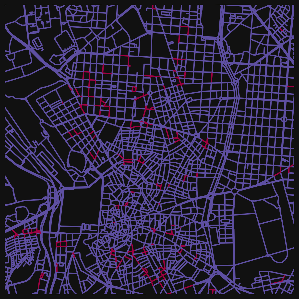
This pattern generalises. Any combination of accessibility columns can be filtered, compared, or combined with & (and), | (or), and standard comparison operators. Some other questions you could answer this way:
- Streets with food and drink access but no health services nearby.
- Areas where both education and sports facilities are beyond 400m (potential service deserts).
- Locations where multiple amenity types cluster together.
Building a composite index
You can also combine weighted counts into a single score. This is the same idea behind the Walkability Index from the earlier lesson: take several individual measures, normalise them, and add them up.
A simple “daily needs” index might combine food, health, and education access. Because the raw counts vary in magnitude (there are far more food premises than health clinics), normalising each column to a 0-1 range makes the combination easier to work with. There are also more sophisticated approaches which might be used by researchers who want to weight varying contributions depending on any number of considerations.
# select the columns to combine
cols = ["cc_food_bev_800_wt", "cc_health_800_wt", "cc_education_800_wt"]

# normalise each column to 0-1 range (min-max scaling)
for col in cols:
    min_val = nodes_gdf[col].min()
    max_val = nodes_gdf[col].max()
    nodes_gdf[f"{col}_norm"] = (nodes_gdf[col] - min_val) / (max_val - min_val)

# sum the normalised columns into a composite score
nodes_gdf["daily_needs_index"] = sum(nodes_gdf[f"{col}_norm"] for col in cols)

fig, ax = plt.subplots(figsize=(8, 8))
fig.set_facecolor("#111")

nodes_gdf.plot(
    "daily_needs_index",
    cmap="magma",
    linewidth=2,
    ax=ax,
)

ax.set_xlim(438000, 440000 + 2500)
ax.set_ylim(4473000, 4475000 + 2500)
ax.axis(False)
(np.float64(438000.0),
np.float64(442500.0),
np.float64(4473000.0),
np.float64(4477500.0))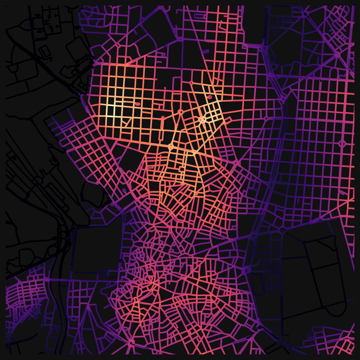
The choice of which categories to include, what distance to use, and whether to weight some categories more heavily than others are all analytical decisions. Different choices produce different indices that foreground different aspects of urban accessibility.
Saving data
The data can be saved to an output .gpkg, which can be used from QGIS for visualisation and analysis.
# uncomment to save the nodes dataframe to a file for use from QGIS
# nodes_gdf.to_file('educ_access.gpkg')
NoteGoing Further
You can also compare before and after interventions: what happens to access if you change the street network, or introduce new amenities?
This notebook is a good candidate for working with an LLM. The code cells follow a repeating pattern: change a column name, change a distance, change a colourmap. If you want to explore different landuse categories, distances, or filtering conditions, try pasting a code cell into an LLM and asking it to adapt it for your case.
Challenge
Using the accessibility columns now available in nodes_gdf, investigate one of the following questions (or propose your own):
- Coverage: Pick two amenity types (e.g. health and sports_rec). Where are streets that have access to both within 200m? Map the result.
- Scale effects: Choose a landuse category and compare its weighted accessibility at 200m vs 800m. Where does access improve most when you widen the search radius? What does that tell you about how that amenity type is distributed?
- Custom index: Build a composite index from three or more categories that represents a planning concept you care about (e.g. “family-friendliness”, “nightlife access”, “essential services”). Normalise, combine, and map.
NoteSolution (Coverage example)
First, plot each category individually to see where access exists:
from matplotlib.colors import ListedColormap
from matplotlib.patches import Patch

# green for access, red for no access
access_cmap = ListedColormap(["red", "green"])
access_legend = [Patch(color="green", label="Within 200m"), Patch(color="red", label="Beyond 200m")]

# streets where health is within 200m
has_health = nodes_gdf["cc_health_nearest_max_800"] <= 200
# streets where sports are within 200m
has_sports = nodes_gdf["cc_sports_rec_nearest_max_800"] <= 200

fig, axes = plt.subplots(1, 2, figsize=(16, 8))
fig.set_facecolor("#111")

for ax, col, title, landuse in zip(
    axes,
    [has_health, has_sports],
    ["Health access", "Sports access"],
    ["health", "sports_rec"],
):
    nodes_gdf.assign(access=col).plot(
        "access",
        cmap=access_cmap,
        linewidth=2,
        ax=ax,
    )
    # overlay the actual premises locations
    poi = mad_prems[mad_prems["division_desc"] == landuse]
    poi.plot(ax=ax, color="white", markersize=8, edgecolor="black", linewidth=0.3, zorder=5)
    ax.legend(handles=access_legend, loc="lower right")
    ax.set_xlim(438000, 440000 + 2500)
    ax.set_ylim(4473000, 4475000 + 2500)
    ax.set_title(title, color="white")
    ax.axis(False)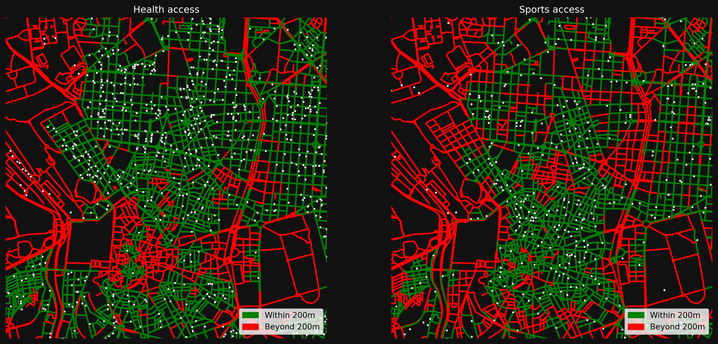
Now combine them to find streets that have access to both:
nodes_gdf["health_and_sports"] = has_health & has_sports

combined_legend = [Patch(color="green", label="Both within 200m"), Patch(color="red", label="Missing one or both")]

fig, ax = plt.subplots(figsize=(8, 8))
fig.set_facecolor("#111")

nodes_gdf.plot(
    "health_and_sports",
    cmap=access_cmap,
    linewidth=2,
    ax=ax,
)

# overlay both health and sports premises
health_pois = mad_prems[mad_prems["division_desc"] == "health"]
sports_pois = mad_prems[mad_prems["division_desc"] == "sports_rec"]
health_pois.plot(ax=ax, color="cyan", markersize=8, edgecolor="black", linewidth=0.3, zorder=5)
sports_pois.plot(ax=ax, color="yellow", markersize=8, edgecolor="black", linewidth=0.3, zorder=5)

combined_legend += [Patch(color="cyan", label="Health"), Patch(color="yellow", label="Sports")]
ax.legend(handles=combined_legend, loc="lower right")
ax.set_xlim(438000, 440000 + 2500)
ax.set_ylim(4473000, 4475000 + 2500)
ax.set_title("Streets with both health and sports access", color="white")
ax.axis(False)
(np.float64(438000.0),
np.float64(442500.0),
np.float64(4473000.0),
np.float64(4477500.0))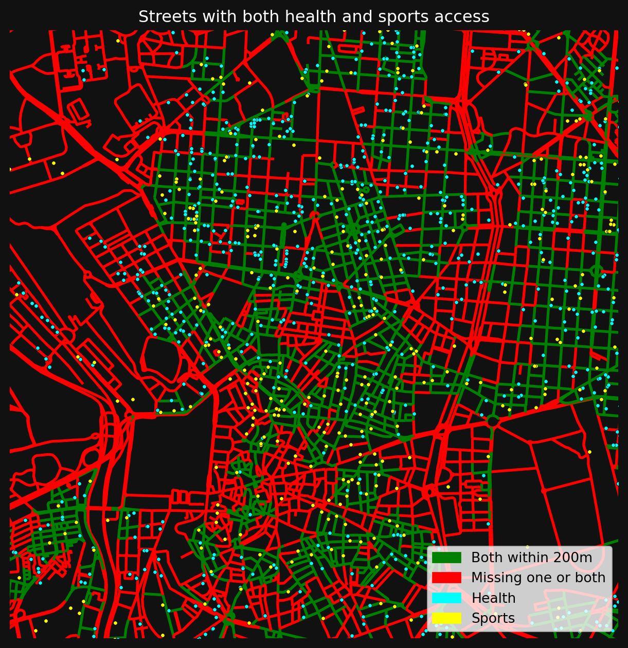
References
© Gareth Simons; The content in this lesson is derived from the following sources: