GIS Maps
The same building heights data can be unreadable or immediately clear depending on how you style it. This module covers the three main styling approaches: single symbol, graduated (for continuous numeric data), and categorised (for categorical data).
Create a new project (Project → New) and add the Neighbourhoods, Blocks, Buildings, and Premises GeoPackages from the datasets page.
This exercise requires the Layer Styling panel. If not visible, go to View → Panels → Layer Styling. This opens a docked panel for styling the selected layer. Alternatively, double-click any layer and select Symbology, but this opens a separate dialog you’ll need to reopen for each layer.
Save your project regularly (Ctrl+S / Cmd+S). Frequent saves prevent lost work.
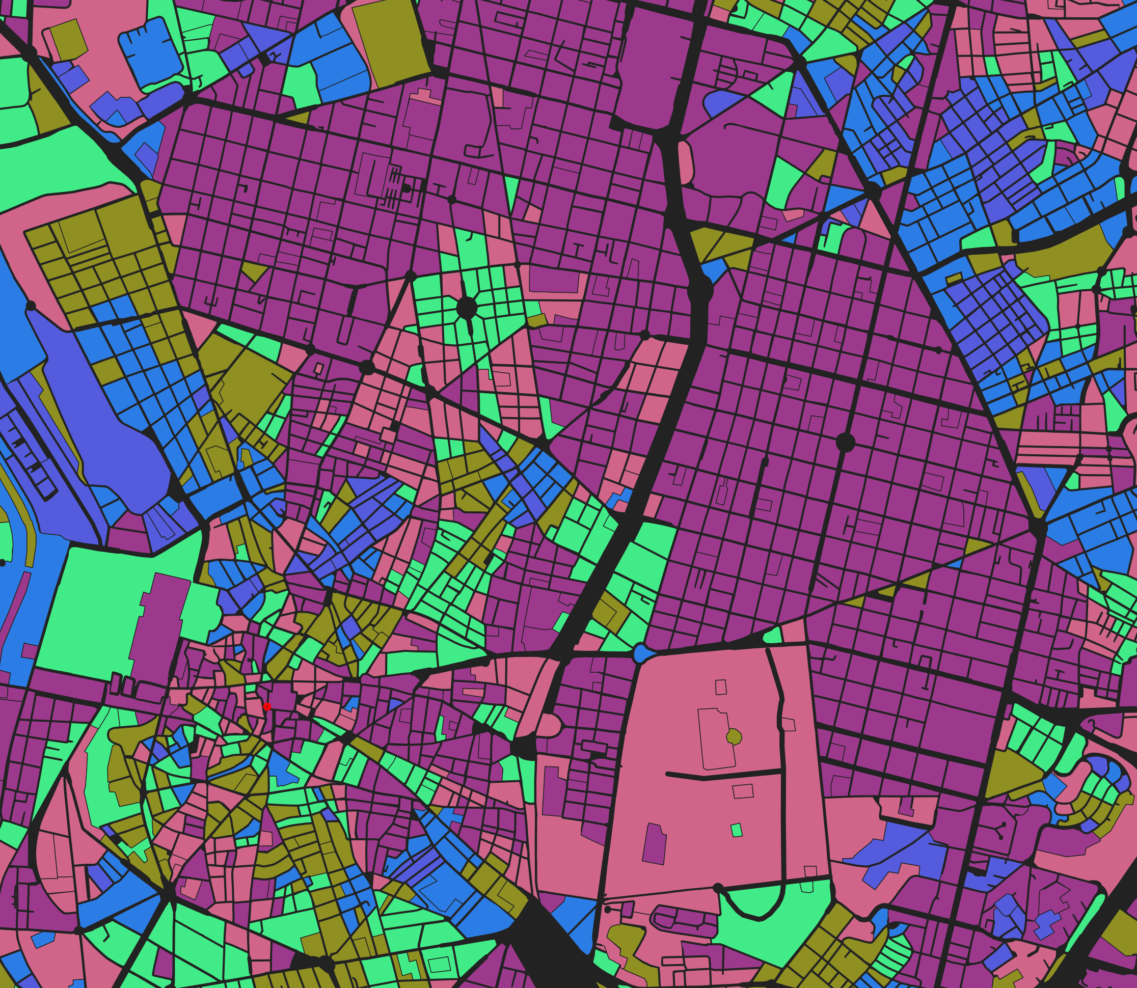
Neighbourhoods
- Notice the ordering of the layers in your
Layerspanel. Select the individual layers and drag to reorganise them so that the smallest (premises) is at the top, then buildings, then blocks, then neighbourhoods. - Hide all layers except neighbourhoods by unchecking their visibility boxes in the Layers panel. Double-check that the neighbourhood layer is selected.
- Then, in the
Layer Stylingpanel, select theSymbologytab, then choose a default style or create your own by selectingSingle Symboland setting the fill colour, opacity, stroke width, and stroke colour. - Use the
Identify Featurestool to select a neighbourhood. Inspect the available fields. Notice that theNOMBREfield contains the neighbourhood name. - Go back to the
Layer Stylingpanel, select theLabelstab, then selectSingle Labels, then select theNOMBREfield. Set the font, size, style, and be sure to pick a colour of sufficient contrast. Notice that the neighbourhood names are now displayed. - Take some time to explore some of the more advanced text styling options such as buffers, masks, placement, and rendering options
Blocks
- Activate visibility for the blocks layer.
- Inspect (
Identify Featurestool) one of the blocks to see available data fields. If you see information for a different layer, check that the correct layer is currently selected in theLayerspanel, and that theIdentify ResultspanelModeis set toCurrent Layer. Notice theblock_orientationfield, which represents the predominant orientation angle of each block. - Go to the
Layer Stylingpanel and select theSymbologytab. The data field is continuous numeric data, so select theGraduateddisplay option, then selectblock_orientationfor theValue. - For
Color Ramp, selectRandom Color Ramp. For orientation data, random colours work because there’s no inherent “high” or “low” value: 0° and 45° aren’t better or worse than each other, they’re just different directions. - Below the
Classespanel, selectFixed Intervalfor theModeand set the interval to around 5-10 degrees. This creates colour bands at fixed intervals, making it easy to see which blocks share similar orientations.
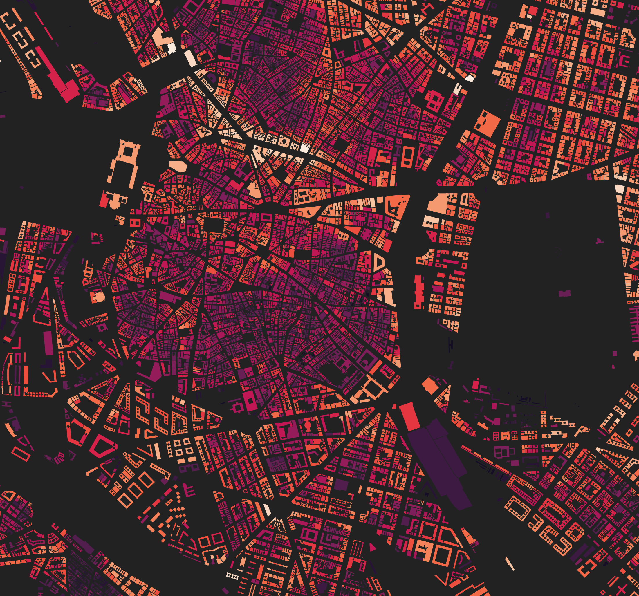
Buildings
- Activate visibility for the buildings layer. This time, we’ll visualise the
mean_heightfield. - In the
Layer Stylingpanel, selectSymbology. Building heights are continuously distributed numeric data, so use theGraduateddisplay option and selectmean_heightfor theValuefield. - For
Color Ramp, select a sequential scheme likeRocketorYlOrRd. Unlike orientation, height has meaningful “low” and “high” values, so a sequential colour ramp (light to dark, or cool to warm) communicates that relationship. - Select
Equal Countfor the mode and increase the number ofClassesto around 10-20. - Expand the
Histogramsection at the bottom of the Symbology tab and clickLoad Values. This shows you the distribution of building heights and where the classification breaks fall. Most buildings are low-rise, with a long tail of taller buildings. - Experiment with different
Modeoptions:Equal Intervalspreads thresholds evenly, but doesn’t work well here because the outliers (few very tall buildings) mean most of the colour range is wasted on heights that rarely occur.Equal Countputs the same number of features in each class, which uses the full colour range but can obscure the actual distribution.Logarithmic Scalehandles long-tailed distributions well by compressing the high end, but can be unstable when the data contains zeros.Natural Breaks (Jenks)finds natural groupings in the data. It can be slow on large datasets but often produces intuitive results.
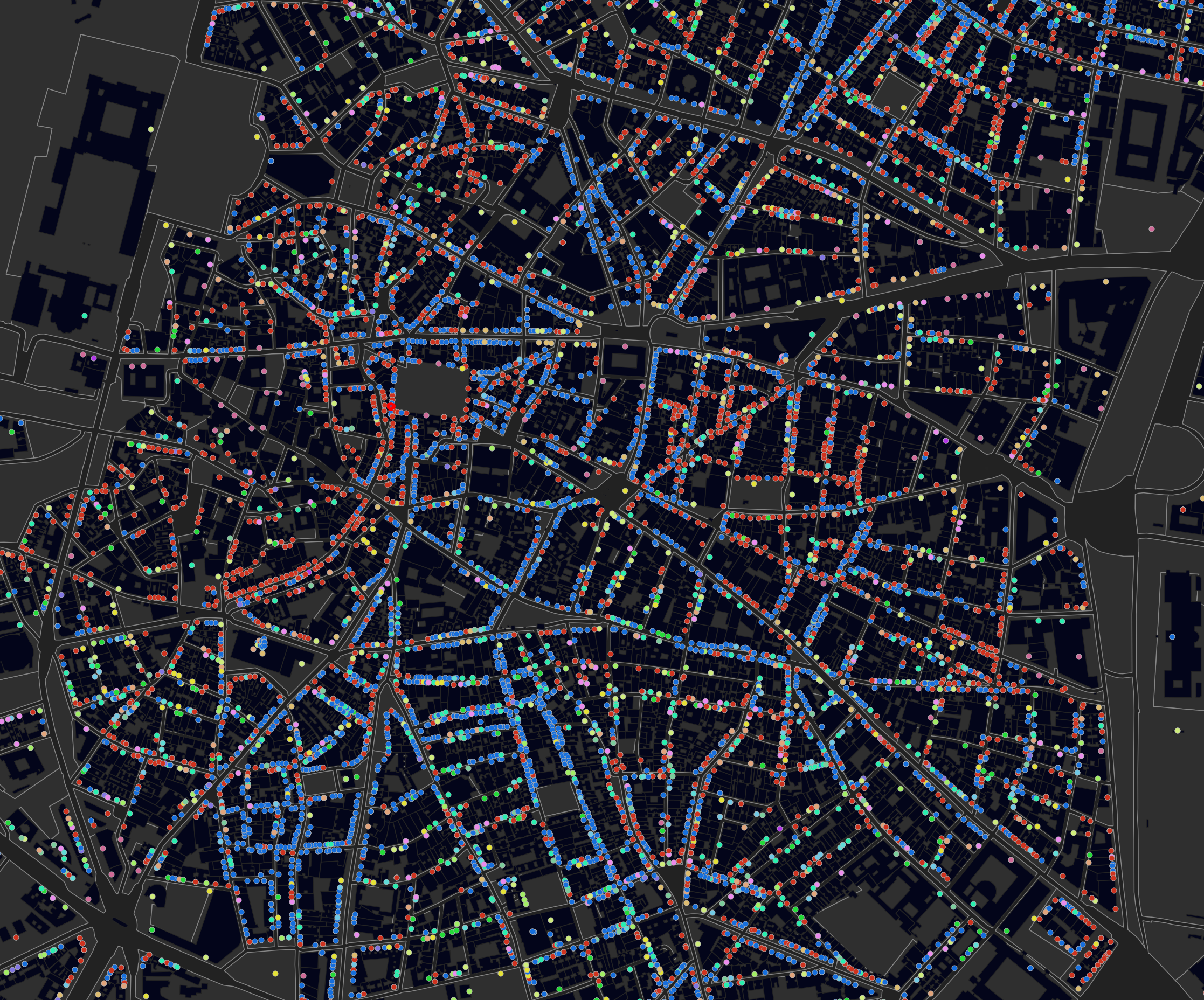
Premises
- Activate visibility for the premises layer. Here, we’re interested in the land uses contained in the
section_descfield. - Select the premises layer, then go to the
Layer Stylingpanel and select theSymbologytab. This time, selectCategorizedbecausesection_desccontains discrete categories rather than continuous numbers. - Select
section_descfor theValuefield, then clickClassifyto populate the category list. Click on theSymbolbutton to fine-tune the colour, size, opacity, and stroke settings.
Assignment: Map data from your data catalogue
Using datasets from your data catalogue, create 2-3 maps that showcase different data types or themes from one of the pilot cities.
Consider: What story does this data tell? What patterns or relationships become visible when mapped?
Focus on clarity. Someone unfamiliar with the data should understand the key patterns at a glance.