Spatial Aggregations
Joins connect information from one layer to another. Non-spatial joins match features by shared attribute keys. Spatial joins match features by their geographic relationships.
This section focuses on spatial joins: using location to aggregate data from one layer into another.
Aggregating data into neighbourhoods introduces the risks discussed in Aggregation Effects: different boundaries would produce different results (MAUP), and patterns at the neighbourhood level may not reflect individual behaviour (ecological fallacy). Keep these limitations in mind when interpreting your maps.
The formal definition of spatial predicates is based on the mathematical relationships between the geometries, and is highly technical. For a more intuitive understanding of what these predicates mean and how they work, take another look at visual examples in the below two links:
For these steps, you’ll need to have downloaded the madrid_nbhds.gpkg and eu_stat_clipped.gpkg datasets linked on the datasets page.
Aggregations
Spatial joins are useful when you need to aggregate or average data into encompassing areas like postcodes or neighbourhoods. The QGIS Count Points in Polygon tool uses this approach implicitly.
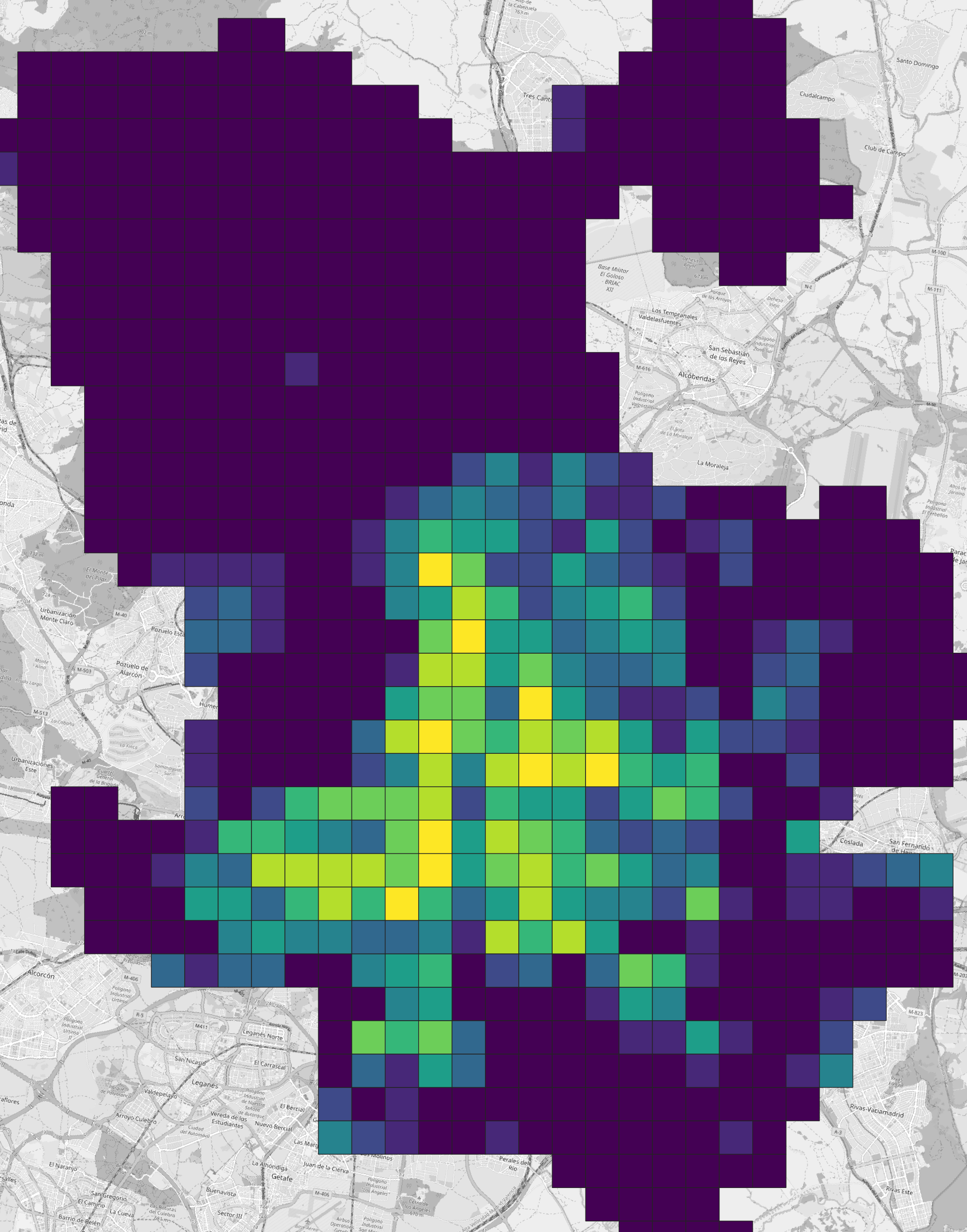
This exercise aggregates census statistics into Madrid neighbourhoods. Open a new project in QGIS and import madrid_nbhds and eu_stat_clipped. The census dataset comes from EU eurostat / GEOSTAT and uses a 1 km grid cell format. Since this is an EU-wide dataset, it uses the EPSG:3035 coordinate reference system. Use this CRS for the exercise so the grid cells display without distortion.
Step 1: Explore
The data contains the following columns:
| Code | Description |
|---|---|
| T | Total population |
| M | Male population |
| F | Female population |
| Y_LT15 | Age under 15 years |
| Y_1564 | Age 15 to 64 years |
| Y_GE65 | Age 65+ years |
| EMP | Employed persons |
| NAT | Born in reporting country |
| EU_OTH | Born in other EU Member State |
| OTH | Born elsewhere |
| SAME | Residence unchanged in past year |
| CHG_IN | Moved within reporting country |
| CHG_OUT | Moved from outside reporting country |
Visualise a few of these columns to understand what the data contains. The overall population counts show some grid cells with over 40,000 people per square kilometre!
Step 2: Join
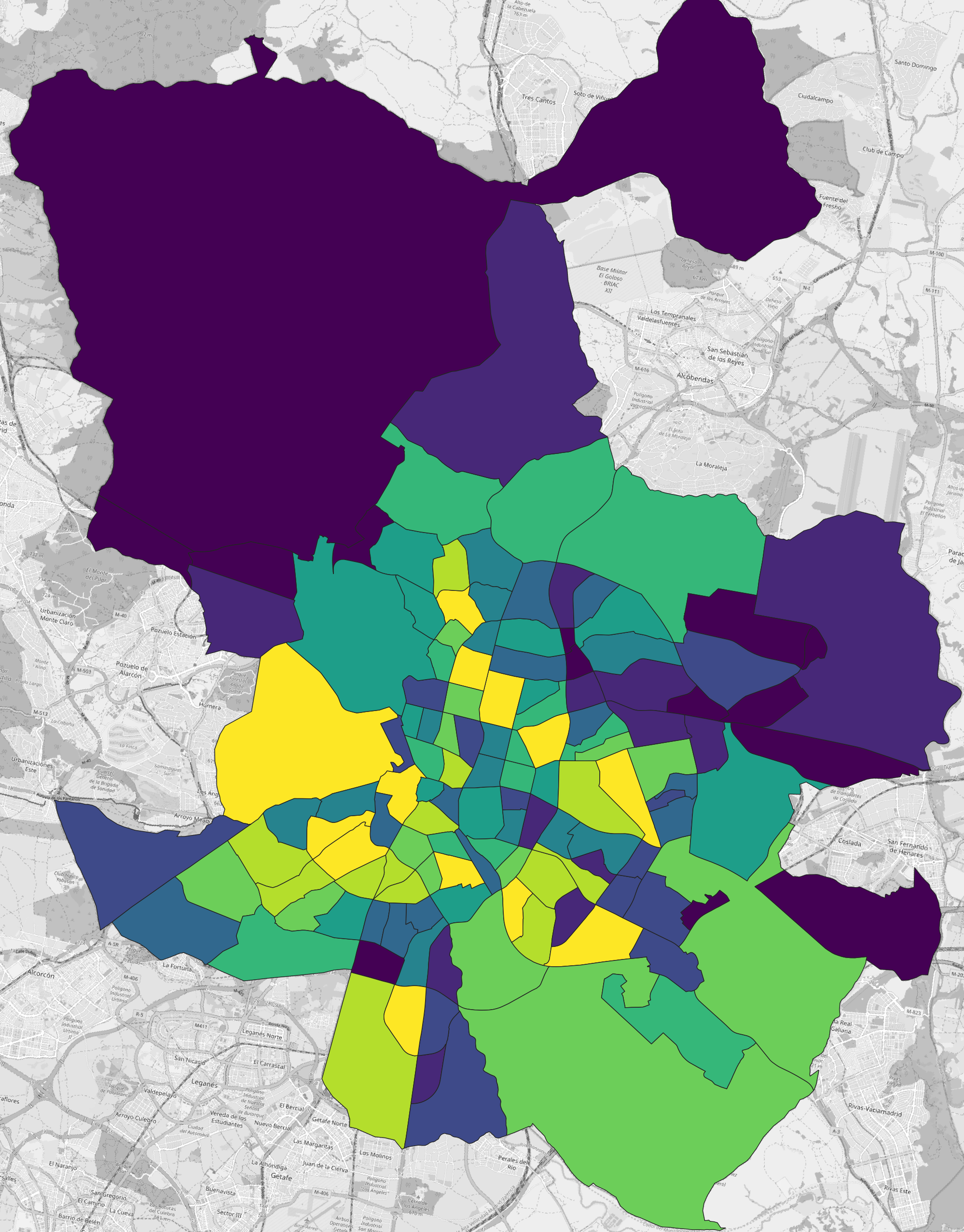
We want to examine the data for each neighbourhood; however, we need to find a way to transform the input data from the grid cells into the polygon extents of the neighbourhoods. This is where a spatial join will be useful: what we want to do is to detect which grid cells intersect each neighbourhood’s Polygon, then we want to aggregate or average the information accordingly. QGIS has a built-in tool for this called Join Attributes by Location (Summary).
To find the tool, open the Processing Toolbox panel and use the search function. Note that there are two Join Attributes by Location but only one of these is appended with (Summary). It is the (Summary) version that we are looking for.
Before we do the join, let’s add an area column to the eu_stat_clipped layer. We’ll explain more about why we want the area information soon.
- Open the Attribute Table for
eu_stat_clipped. - Add a Decimal column called
areausing the$area / (1000 * 1000)expression – we are converting square metres to square kilometres. - Save and close.
Now run the join:
- Open
Join Attributes by Location (Summary). - For
Join features inselectmadrid_nbhds. This is the layer where the join will be performed. - Use
intersectfor the predicate. - Compare to
eu_stat_clipped. This is the layer from which data will be joined. - Click the flyout button for
Fields to summariseand select each of the 13 columns in the above table plus your newareacolumn. Then click OK to return to the previous view. - Click the flyout button for
Summaries to calculateand selectsum. Then click OK to return to the previous view. - Run the join and return to the map view where you will see a new
Joined layer.
intersect and double-counting
Using intersect with grid cells is a pragmatic shortcut, but it has a key limitation: if a grid cell overlaps multiple neighbourhood polygons, its full counts can be included in multiple neighbourhoods. That can inflate totals and distort ratios near boundaries.
For a more defensible aggregation, you have two common options:
- Assign each cell to one neighbourhood (e.g., join using cell centroids / point-on-surface and a
containspredicate). - Area-weight the counts by intersecting cells with neighbourhoods and scaling values by the proportion of cell area inside each neighbourhood.
For this exercise we proceed with intersect to focus on the mechanics of spatial joins and normalisation, but interpret results as approximate.
Open the Attribute Table for your Joined layer. You should see columns ending in _sum (e.g., T_sum, M_sum, area_sum). If these columns are missing or contain only NULL values, check that you selected the correct fields and summary type before re-running the join.
Normalisation
Visualise the summed population (T_sum) column for the neighbourhoods in the new Joined layer. You can see that the result of the summation is heavily impacted by the size of the neighbourhood: the larger the neighbourhood the more cells will be intersected and the more population there is to sum. Just because there is more population in a larger neighbourhood doesn’t mean there is more population per unit area (density). This is why we need the area column.
Normalising by area
One way to handle situations such as this is to normalise population counts per unit area.
- Open the Attribute Table for your
Joined layer. - Create a new Decimal column called
T_pop_km2using the expression"T_sum" / "area_sum". This will divide the summed population by the summed area for the intersected grid cells. - Save and close.
Visualise the new T_pop_km2 column.
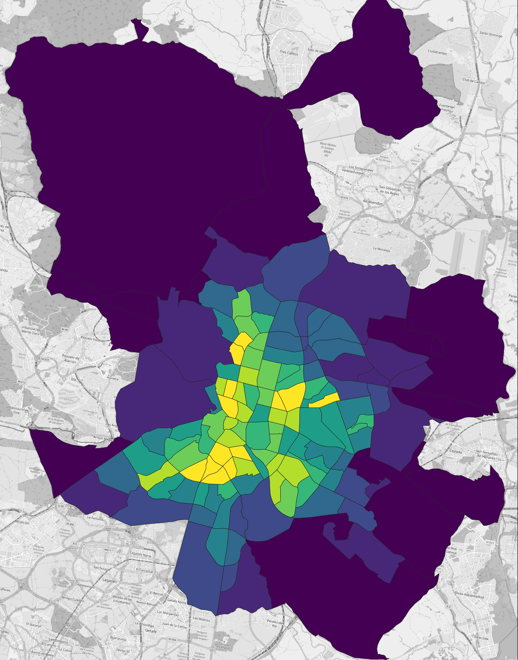
This is much more useful and can be interpreted as the population per square kilometre for a given neighbourhood. The highest population per square kilometre is now in Acacias neighbourhood, with an average of 35,000 people per km2.
Normalising by population
When we were dealing with total population counts, it made sense to normalise by area. However, in situations where we are working with other population statistics, such as the number of employed people, it is better to normalise by unit population.
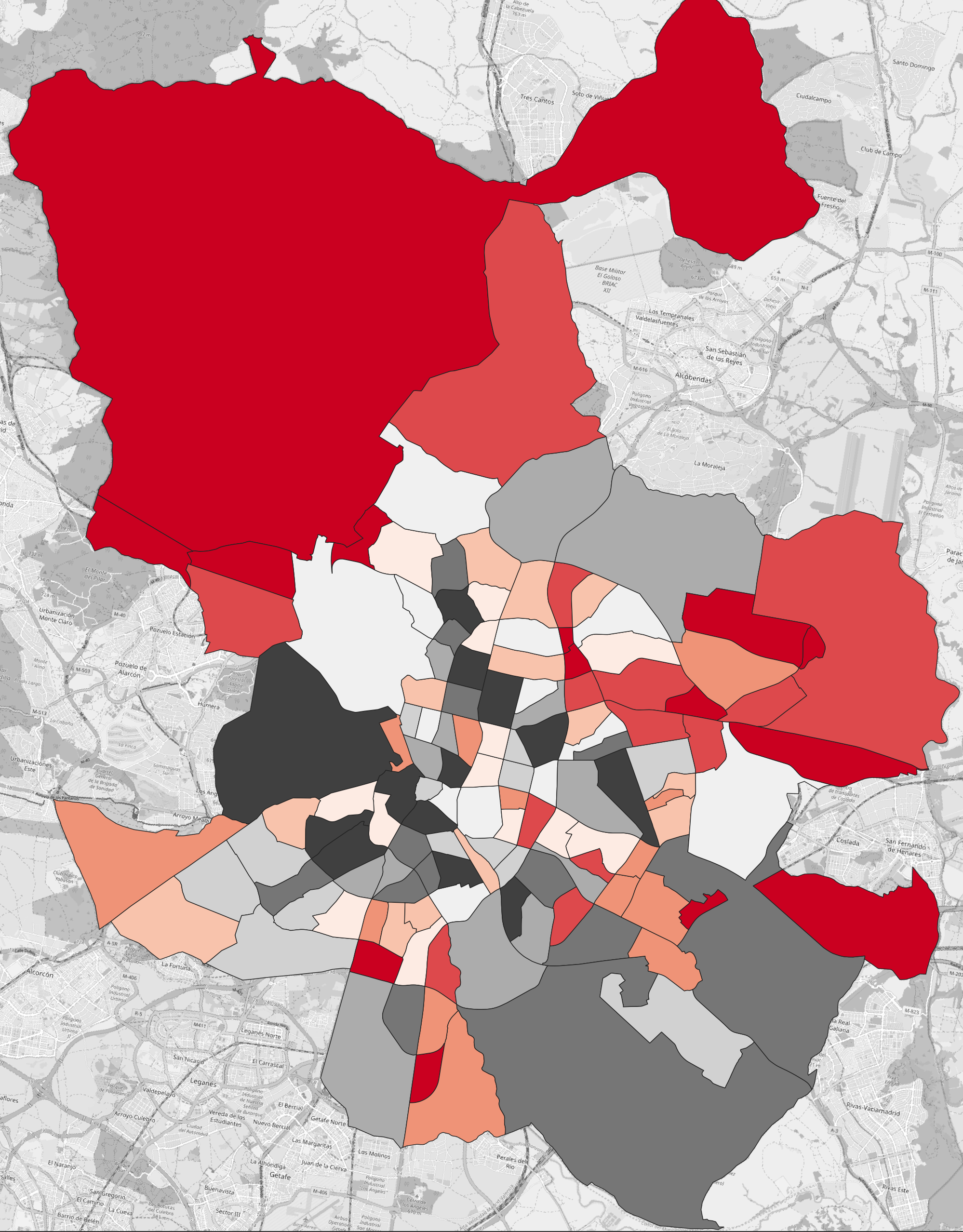
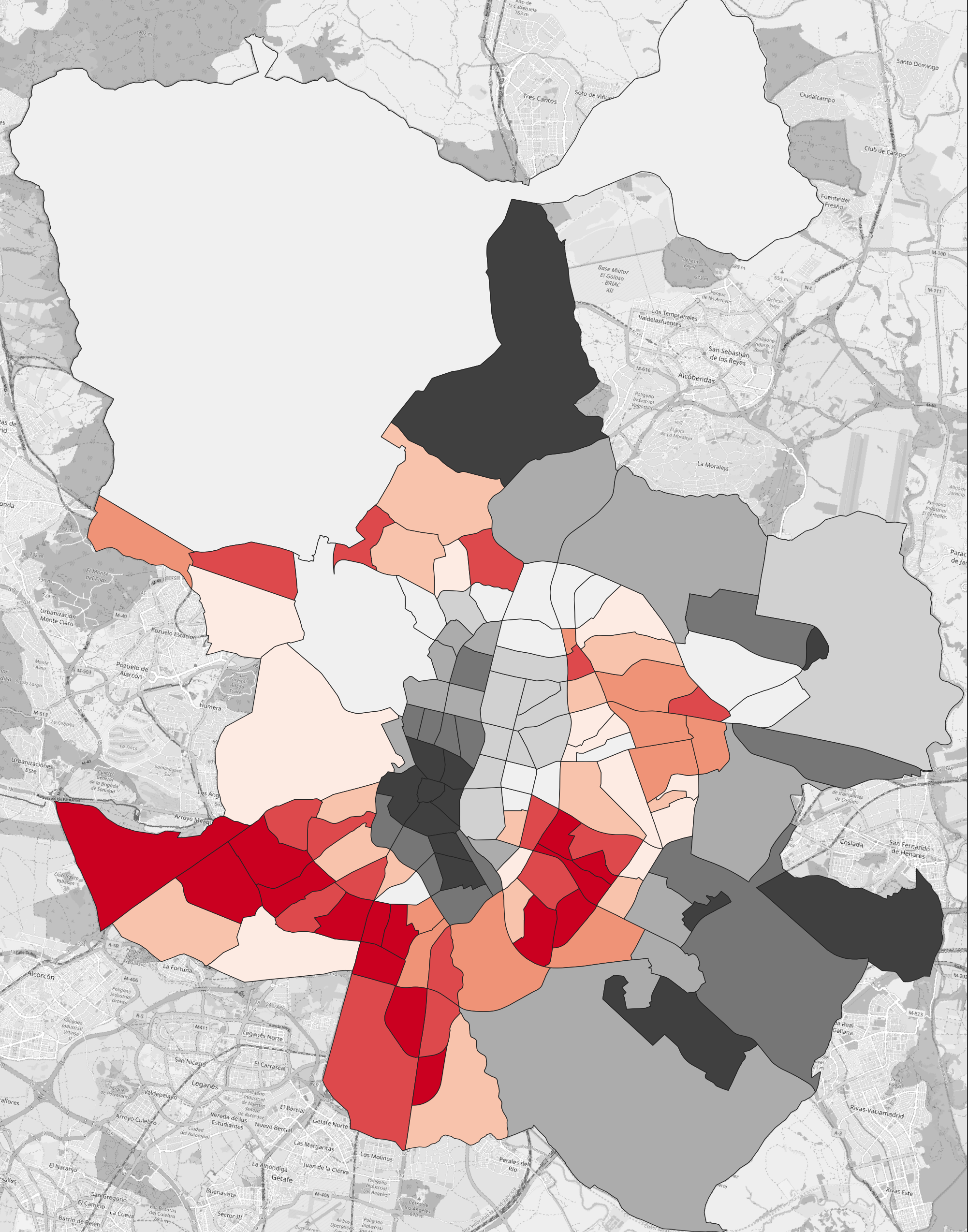
This image shows the number of employed people per neighbourhood, where red is lower and black is higher. In this form, the map is not intuitive because it doesn’t communicate employment as a ratio of each neighbourhood’s population.
To fix this, we’ll use the ratio of employed people instead:
- Open the Attribute Table for your
Joined layer. - Create a new Decimal column called
EMP_ratiousing the expression"EMP_sum" / "T_sum". This will divide the count of employed persons by the total population. - Save and close.
Visualise the EMP_ratio column.
Once we normalise by population count the map becomes much more useful: now we can see relative to the population size of a given neighbourhood whether people are more or less employed. In this case, we can see that the South-West parts of Madrid have lower levels of employment.
Challenge
Split the census columns amongst yourselves and visualise each, using appropriate forms of normalisation. Compare and discuss: are there any patterns emerging from the data?