# uncomment to install
# !pip install networkx matplotlibNetwork Centrality
Some sidewalks attract more pedestrians than others. Certain businesses cluster in specific areas. Vibrant, walkable streets become destinations in themselves. These patterns aren’t accidental, but it’s hard to predict how a new street network will actually function once built. Network analysis gives us a way to compare street configurations and model how streets work together as a system.
The Idea of Centrality
Network methods have a long history across many fields, from early work on telecommunication networks (Shimbel 1953) to social network analysis (Wasserman and Faust 1994). Space Syntax, developed by Bill Hillier and colleagues in the late 1970s and early 1980s (Hillier and Hanson 1984), combined a social theory of space with network measures to analyse cities, and established street network analysis as a tool for urban design and planning.
A network (or graph) consists of nodes (vertices) connected by links (edges). In a social network, the nodes are people and the links are relationships. Network analysis measures how connected or “central” each node is, which tells you something about its importance within the system.
Two common centrality measures are:
- closeness centrality (Sabidussi 1966): how close a node is to all other nodes.
- betweenness centrality (Freeman 1977): how often a node lies on the shortest path between other nodes.
A simple example with NetworkX
These measures are computed using shortest-path algorithms. We’ll use NetworkX, a widely used network analysis package, to build a graph and compute closeness and betweenness on a simple example.
Install the packages if you haven’t already:
Import the packages:
import networkx as nx  # networkx is imported as nx by convention
import matplotlib.pyplot as plt  # we'll use this for plotting
Start by creating a simple graph using a networkX Graph object.
# create an empty graph
G = nx.Graph()
At the moment, our graph is empty:
G.nodes()NodeView(())Add some nodes using the Graph’s add_node() method.
# in networkX you can add nodes to a graph
# nodes need an identifier - we'll use letters
G.add_node('A')
G.add_node('B')
G.add_node('C')
G.add_node('D')

print('Number of nodes:', G.number_of_nodes())
print('Nodes:', G.nodes())
Number of nodes: 4
Nodes: ['A', 'B', 'C', 'D']Now connect them with edges using the Graph’s add_edge() method.
# from which node to which node the edge should be added
G.add_edge('A', 'B')
G.add_edge('A', 'C')
G.add_edge('A', 'D')

print('Number of edges:', G.number_of_edges())
print('Edges:', G.edges())
Number of edges: 3
Edges: [('A', 'B'), ('A', 'C'), ('A', 'D')]Can you guess which node is the most central?
NetworkX has built-in drawing methods. We’ll use draw() to visualise it.
# draws graph using automatic layout generation
nx.draw(
  G,
  with_labels=True,
  node_size=800,
  font_weight="bold"
)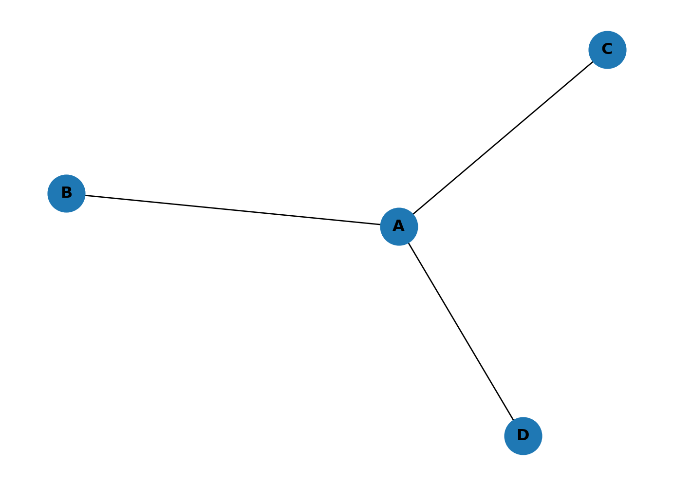
A is more central because it connects to all other nodes. NetworkX has built-in methods for computing closeness and betweenness (and hundreds of other measures).
Compute closeness:
# computes closeness
closeness = nx.closeness_centrality(G)
print(closeness)
{'A': 1.0, 'B': 0.6, 'C': 0.6, 'D': 0.6}This returns a dictionary mapping each node label to its closeness centrality. A scores highest because it can reach every other node in a single step, while the other nodes each need two steps to reach each other.
What about betweenness?
# computes betweenness
betw = nx.betweenness_centrality(G, normalized=False)
print(betw)
{'A': 3.0, 'B': 0.0, 'C': 0.0, 'D': 0.0}A sits on the shortest path between all three pairs of peripheral nodes (B-C, B-D, C-D), giving it a score of 3. The other nodes score 0 because no shortest path passes through them.
LLM Challenges
Use an LLM to do the following:
- Print the node with the highest closeness and the node with the highest betweenness.
- Add node E connected to C, and node F connected to D. Plot the graph and print the top node for each measure. How has the ranking changed?
- Add a link between E and F, then place a new node G in the middle of A, D, C, E, F and connect it to each of them. Plot and print the top nodes again. What happens when the graph has two hubs instead of one?
Karate Club shenanigans
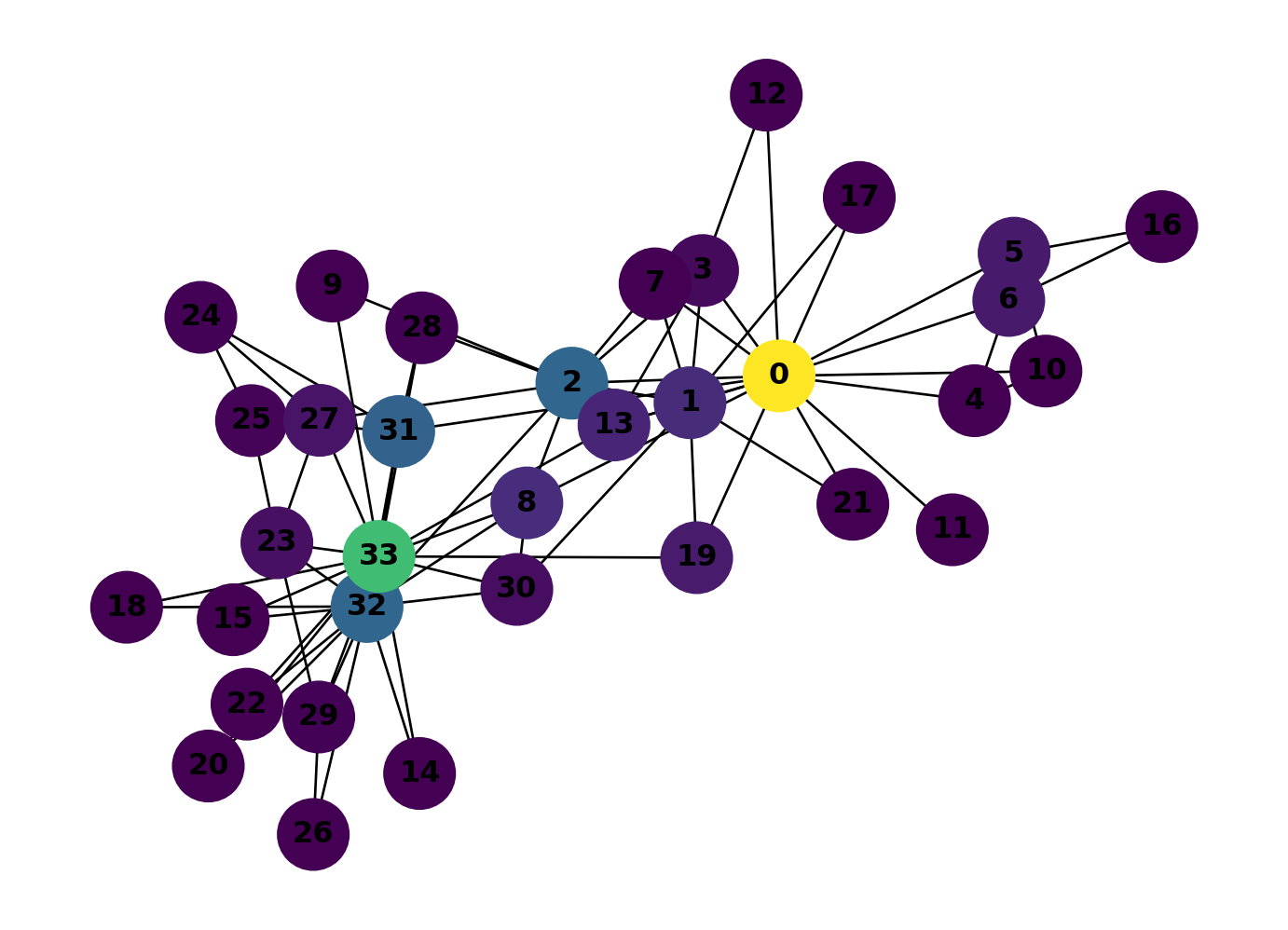
networkX includes several well-known example networks. The karate_club_graph is a classic social network dataset: 34 members of a karate club, connected by friendships observed outside of class.
# generates an example network
GK = nx.karate_club_graph()

# draw
nx.draw(
  GK,
  with_labels=True,
  node_size=800,
  font_weight="bold"
)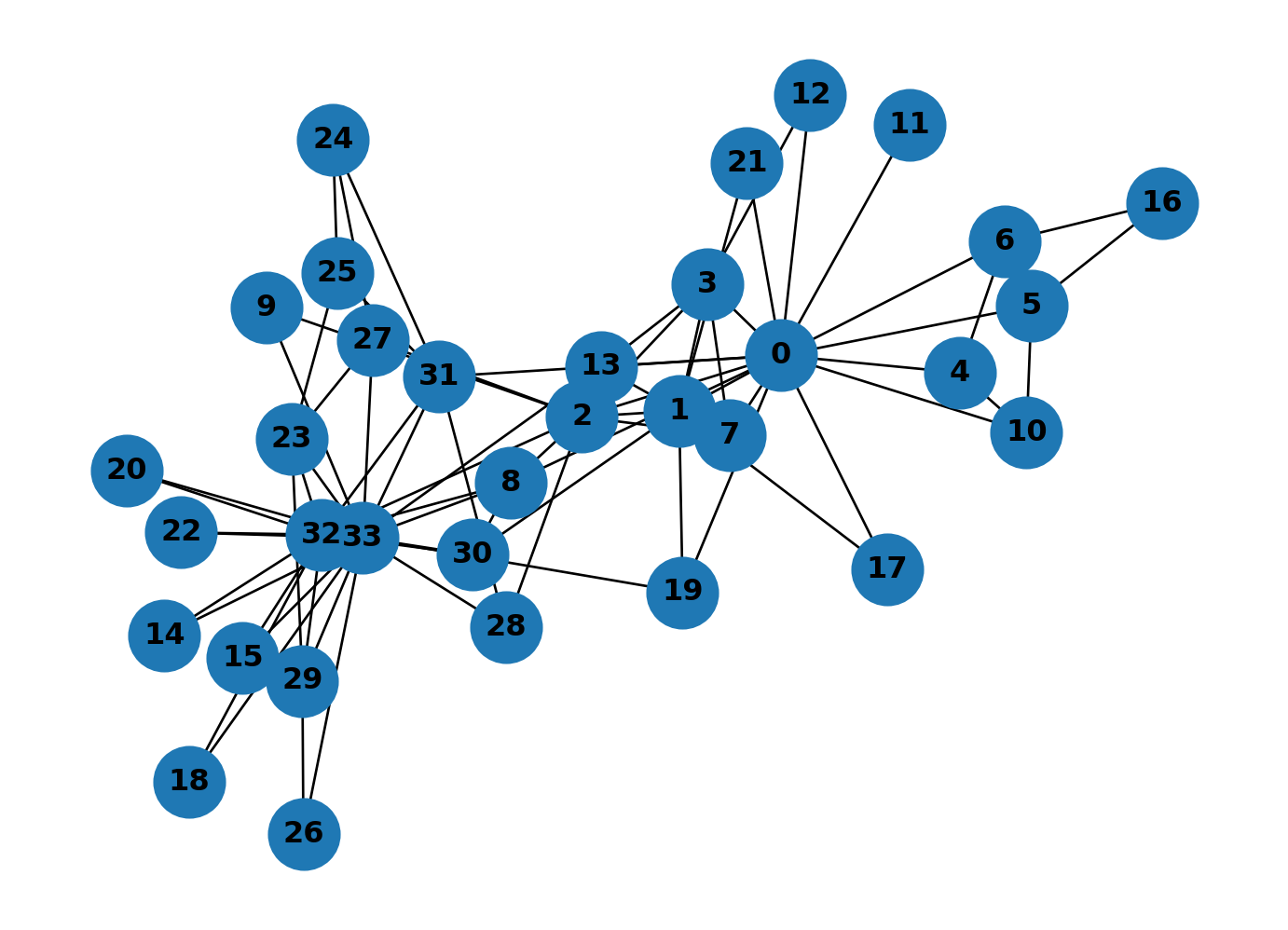
With 34 nodes and many cross-connections, visual inspection alone won’t tell you much. Compute closeness for this graph:
# computes closeness
closeness_dict = nx.closeness_centrality(GK)
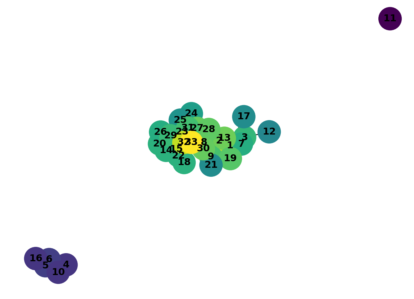
print(closeness_dict){0: 0.5689655172413793, 1: 0.4852941176470588, 2: 0.559322033898305, 3: 0.4647887323943662, 4: 0.3793103448275862, 5: 0.38372093023255816, 6: 0.38372093023255816, 7: 0.44, 8: 0.515625, 9: 0.4342105263157895, 10: 0.3793103448275862, 11: 0.36666666666666664, 12: 0.3707865168539326, 13: 0.515625, 14: 0.3707865168539326, 15: 0.3707865168539326, 16: 0.28448275862068967, 17: 0.375, 18: 0.3707865168539326, 19: 0.5, 20: 0.3707865168539326, 21: 0.375, 22: 0.3707865168539326, 23: 0.39285714285714285, 24: 0.375, 25: 0.375, 26: 0.3626373626373626, 27: 0.4583333333333333, 28: 0.4520547945205479, 29: 0.38372093023255816, 30: 0.4583333333333333, 31: 0.5409836065573771, 32: 0.515625, 33: 0.55}Colour-coding nodes by centrality value makes the pattern visible. Extract the values as a list so NetworkX can use them for node colours.
# Get node colors based on centrality values
node_cols = list(closeness_dict.values())

node_cols[:3]
[0.5689655172413793, 0.4852941176470588, 0.559322033898305]Pass this list to node_color and set a colour map with cmap. viridis is a good default: it’s perceptually uniform, so equal differences in value produce equal differences in colour.
# Draw the graph
nx.draw(
    GK,
    with_labels=True,
    node_color=node_cols,  # Magnitudes for node colours
    cmap=plt.cm.viridis,  # Color map for nodes
    node_size=800,
    font_weight="bold"
)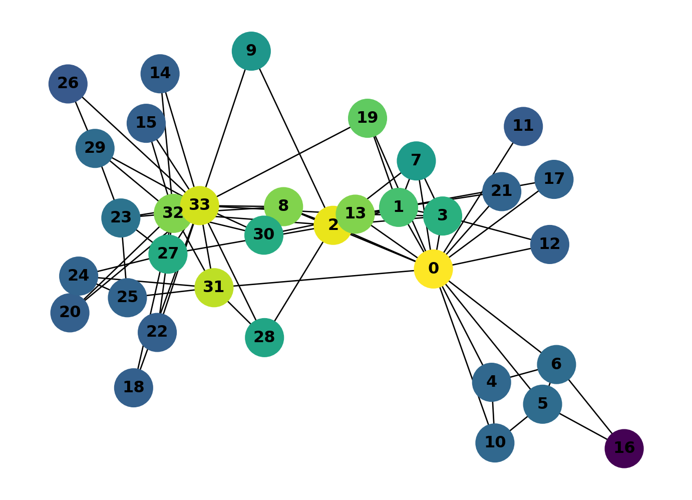
Looks like 0 and 2 have the chops… but 31 and 33 are hot on their heels!
LLM Challenge
Question 1
Which karate club nodes have the highest betweenness centralities? Create a colour-coded plot of your findings.
The highest-betweenness nodes aren’t necessarily the same as the highest-closeness nodes. The two measures capture different things, though they’re often correlated. You’ll see this pattern again in street networks.
Question 2
Character 2 accidentally knocks out character 0 in a karate match under not-at-all suspicious circumstances. Character 0 must now recover in hospital for a month. How does this affect the closeness and betweenness of the network? Would you expect the network to change significantly? Who will rule the roost in the meantime?
Madrid Metro
Madrid’s Metro has 220 stations across 13 lines. That makes it a useful real-world network: complex enough to reveal structure, small enough to visualise in full.
We’ve prepared two CSV files from the Metro’s public timetable data (GTFS format). One lists stations with their coordinates, the other lists connections between consecutive stations on each line. Download them here: metro_nodes.csv and metro_edges.csv. If you’re curious how these were produced from the raw GTFS files, see Metro Network: How It Was Made.
import pandas as pd

nodes = pd.read_csv("../../data/madrid_metro_gtfs/metro_nodes.csv")
edges = pd.read_csv("../../data/madrid_metro_gtfs/metro_edges.csv")

print(f"Stations: {len(nodes)}, Connections: {len(edges)}")
Stations: 220, Connections: 257nodes.head()| station | lat | lon | |
|---|---|---|---|
| 0 | ABRANTES | 40.38083 | -3.72790 |
| 1 | ACACIAS | 40.40387 | -3.70664 |
| 2 | AEROPUERTO T-4 | 40.49177 | -3.59325 |
| 3 | AEROPUERTO T1-T2-T3 | 40.46864 | -3.56954 |
| 4 | ALAMEDA DE OSUNA | 40.45779 | -3.58752 |
edges.head()| station_a | station_b | line | color | |
|---|---|---|---|---|
| 0 | TRES OLIVOS | FUENCARRAL | 10 | #005AA9 |
| 1 | FUENCARRAL | BEGOÑA | 10 | #005AA9 |
| 2 | BEGOÑA | CHAMARTIN | 10 | #005AA9 |
| 3 | CHAMARTIN | PLAZA DE CASTILLA | 10 | #005AA9 |
| 4 | PLAZA DE CASTILLA | CUZCO | 10 | #005AA9 |
Now we build the graph. Each row in the nodes file becomes a node (with lat/lon attributes), and each row in the edges file becomes an edge (with line name and colour). Interchange stations like Sol or Avenida de America appear in multiple edge rows but only once as a node, so they naturally become hubs in the graph.
G_metro = nx.Graph()

# add stations as nodes
for _, row in nodes.iterrows():
    G_metro.add_node(row["station"], lat=row["lat"], lon=row["lon"])

# add connections as edges
for _, row in edges.iterrows():
    G_metro.add_edge(row["station_a"], row["station_b"],
                     color=row["color"], line=row["line"])

print(f"Nodes (stations): {G_metro.number_of_nodes()}")
print(f"Edges (connections): {G_metro.number_of_edges()}")
Nodes (stations): 220
Edges (connections): 254Geographic coordinates give us a layout that matches the actual city. Each edge is coloured by its metro line.
pos = {n: (data["lon"], data["lat"]) for n, data in G_metro.nodes(data=True)}
edge_colours = [G_metro.edges[e]["color"] for e in G_metro.edges()]

fig, ax = plt.subplots(figsize=(12, 10))
nx.draw(
    G_metro,
    pos=pos,
    ax=ax,
    node_size=30,
    node_color="white",
    edgecolors="black",
    linewidths=0.5,
    edge_color=edge_colours,
    width=2.5,
    with_labels=True,
    font_size=4,
)
ax.set_aspect("equal")
plt.tight_layout()
plt.show()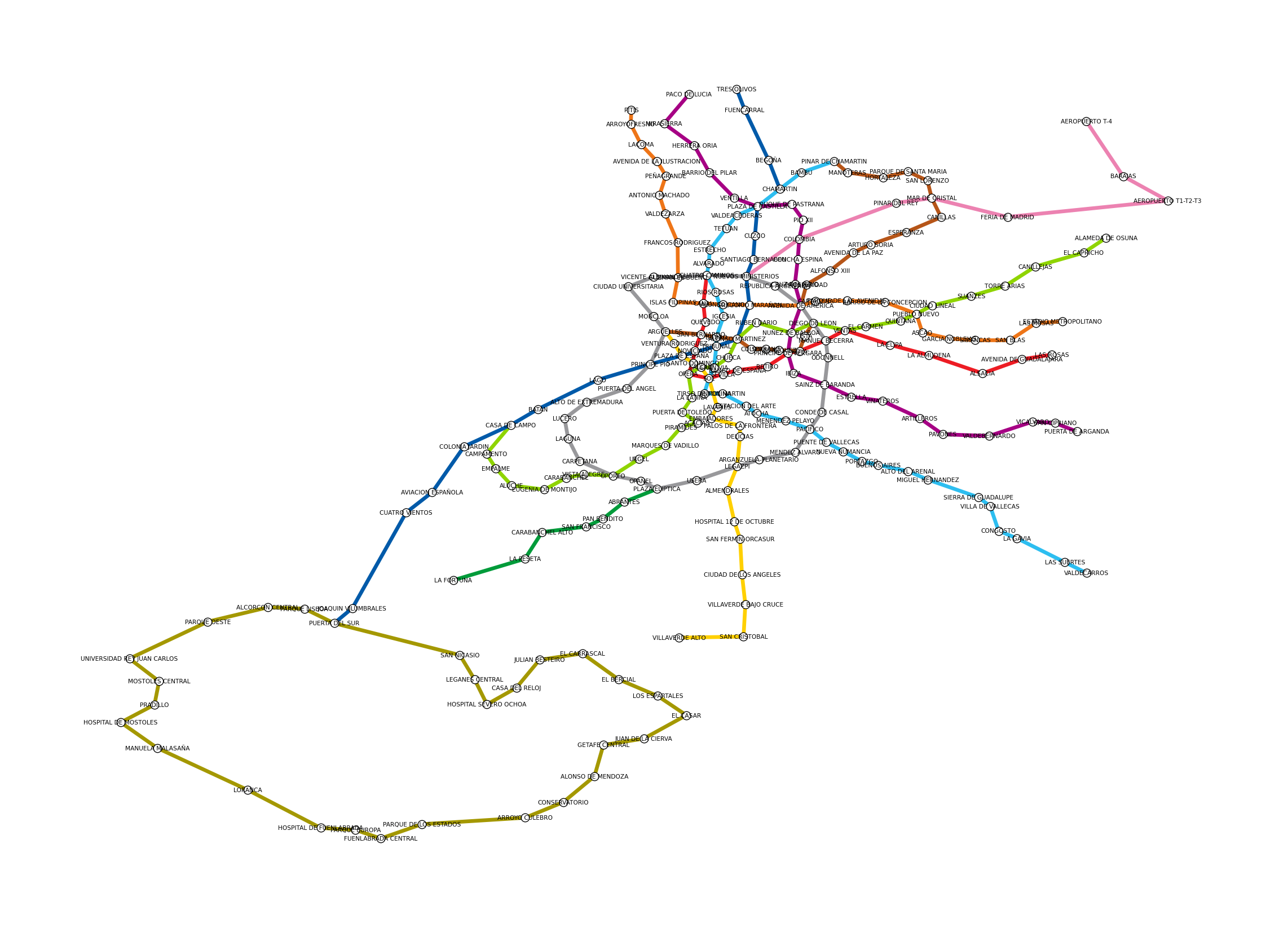
Recognisable as Madrid, even without a basemap. The circular Line 6 is visible in the centre, the suburban lines radiate outward, and interchange stations appear where lines cross.
Closeness centrality
Closeness measures how many steps it takes to reach every other station. Stations with high closeness are, on average, fewest transfers away from everywhere else.
closeness = nx.closeness_centrality(G_metro)

node_colours = [closeness[n] for n in G_metro.nodes()]
node_ec = ["red" if n == "SOL" else "black" for n in G_metro.nodes()]
node_lw = [2.0 if n == "SOL" else 0.3 for n in G_metro.nodes()]

fig, ax = plt.subplots(figsize=(12, 10))
nx.draw(
    G_metro,
    pos=pos,
    ax=ax,
    node_size=50,
    node_color=node_colours,
    cmap=plt.cm.viridis,
    edgecolors=node_ec,
    linewidths=node_lw,
    edge_color="lightgrey",
    width=1.5,
    with_labels=False,
)
ax.set_aspect("equal")
plt.tight_layout()
plt.show()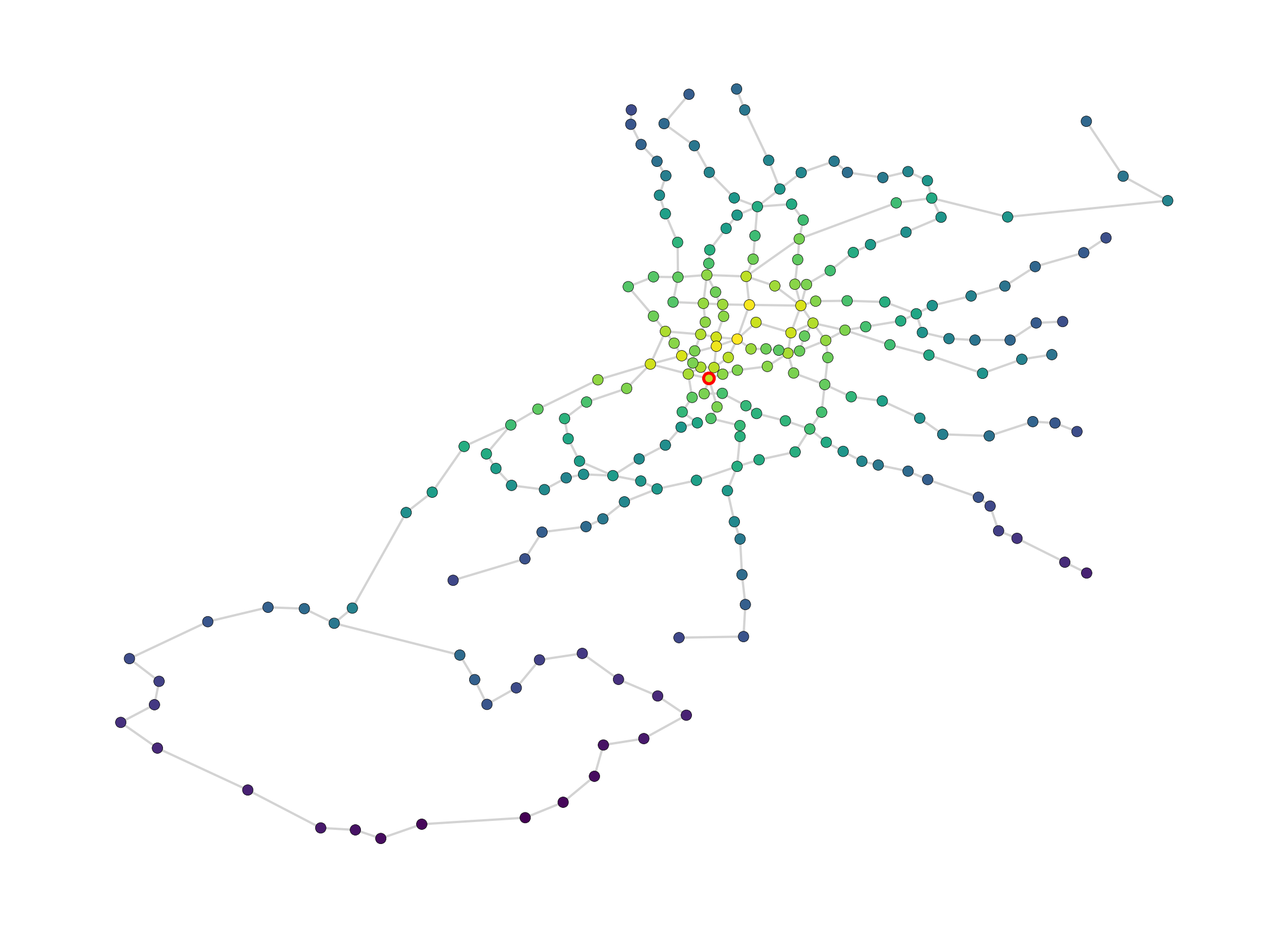
# top 5 stations by closeness
top_close = sorted(closeness.items(), key=lambda x: x[1], reverse=True)[:5]
print("Top 5 stations by closeness centrality:")
for station, score in top_close:
    print(f"  {station}: {score:.4f}")
Top 5 stations by closeness centrality:
ALONSO MARTINEZ: 0.1193
GREGORIO MARAÑON: 0.1183
TRIBUNAL: 0.1174
AVENIDA DE AMERICA: 0.1145
PLAZA DE ESPAÑA: 0.1144The highest closeness stations cluster around the core of the network, where lines converge and distances to the rest of the system are shortest.
Betweenness centrality
Betweenness counts how often a station sits on the shortest path between other pairs of stations. High betweenness means a station acts as a bottleneck: lots of journeys have to pass through it.
betweenness = nx.betweenness_centrality(G_metro, normalized=False)

node_colours_btw = [betweenness[n] for n in G_metro.nodes()]
node_ec_btw = ["red" if n == "SOL" else "black" for n in G_metro.nodes()]
node_lw_btw = [2.0 if n == "SOL" else 0.3 for n in G_metro.nodes()]

fig, ax = plt.subplots(figsize=(12, 10))
nx.draw(
    G_metro,
    pos=pos,
    ax=ax,
    node_size=50,
    node_color=node_colours_btw,
    cmap=plt.cm.viridis,
    edgecolors=node_ec_btw,
    linewidths=node_lw_btw,
    edge_color="lightgrey",
    width=1.5,
    with_labels=False,
)
ax.set_aspect("equal")
plt.tight_layout()
plt.show()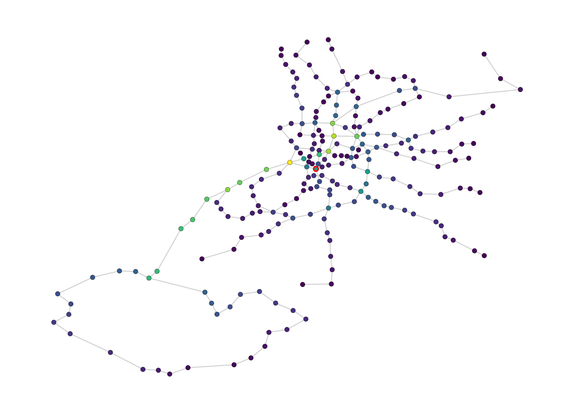
# top 5 stations by betweenness
top_betw = sorted(betweenness.items(), key=lambda x: x[1], reverse=True)[:5]
print("Top 5 stations by betweenness centrality:")
for station, score in top_betw:
    print(f"  {station}: {score:.4f}")
Top 5 stations by betweenness centrality:
PRINCIPE PIO: 7973.7628
GREGORIO MARAÑON: 7109.4008
ALONSO MARTINEZ: 6881.8563
CASA DE CAMPO: 6584.9690
NUEVOS MINISTERIOS: 6479.5417Betweenness highlights a different set of stations than closeness. Interchange stations on radial lines tend to score highest because they bridge different parts of the network. A station can be central (close to everything) without being a bottleneck, and vice versa.
What if Sol closes?
Sol is one of Madrid’s busiest interchange stations, connecting lines 1, 2, and 3 in the heart of the city. What happens to the network if it shuts down for maintenance?
# copy the graph and remove Sol
G_no_sol = G_metro.copy()
G_no_sol.remove_node("SOL")

# recompute centralities
closeness_no_sol = nx.closeness_centrality(G_no_sol)
betweenness_no_sol = nx.betweenness_centrality(G_no_sol, normalized=False)
pos_no_sol = {n: (data["lon"], data["lat"])
for n, data in G_no_sol.nodes(data=True)}
node_colours_no_sol = [betweenness_no_sol[n] for n in G_no_sol.nodes()]
fig, ax = plt.subplots(figsize=(12, 10))
nx.draw(
G_no_sol,
pos=pos_no_sol,
ax=ax,
node_size=50,
node_color=node_colours_no_sol,
cmap=plt.cm.viridis,
edgecolors="black",
linewidths=0.3,
edge_color="lightgrey",
width=1.5,
with_labels=False,
)
ax.set_aspect("equal")
plt.tight_layout()
plt.show()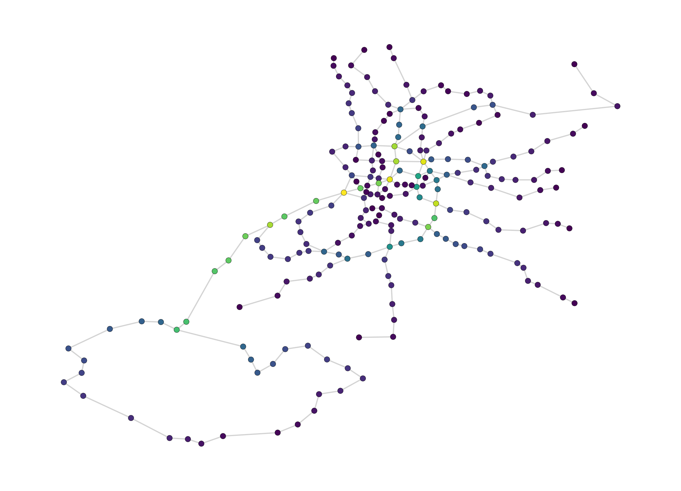
# compare: which stations gained the most betweenness?
shared = set(betweenness.keys()) & set(betweenness_no_sol.keys())
changes = {s: betweenness_no_sol[s] - betweenness[s] for s in shared}
top_gains = sorted(changes.items(), key=lambda x: x[1], reverse=True)[:5]

print("Stations gaining the most betweenness after Sol closes:")
for station, delta in top_gains:
    print(f"  {station}: +{delta:.4f}")
Stations gaining the most betweenness after Sol closes:
CONDE DE CASAL: +2446.9739
SAINZ DE BARANDA: +2421.8489
NUÑEZ DE BALBOA: +2166.6477
PACIFICO: +1853.5572
PRINCIPE DE VERGARA: +1845.5307Removing Sol forces traffic through neighbouring stations. The stations that absorb the most betweenness are the ones that pick up Sol’s role as a connector between lines. This kind of analysis is directly useful for planning service disruptions: it tells you which stations will bear the extra load.
LLM Challenge
Remove Alonso Martinez and report back on which stations gain the most through traffic and which lose the most.
Technicalities
Street network analysis in practice involves several choices that affect how results behave. The main ones are:
- global vs. localised analysis;
- how the street network is represented as a graph;
- what distance metric is used to find shortest paths (topological, metric, or geometric).
Scales of Analysis
Global analysis computes centrality across an entire city network at once. The problem is that centrality values scale with network size: bigger networks produce bigger values. This makes global analysis sensitive to how you draw the boundary, which creates several issues:
- Boundary definition is inconsistent. Where does one city end and the next begin? For large urban agglomerations this is rarely clear-cut. Techniques like network percolation (Arcaute et al. 2016) can help, but there is no simple solution;
- Edge effects. Centrality values drop off near the boundary because the algorithm can’t see the network beyond it. This distorts results for peripheral areas (Turner 2007; Van Nes and Yamu 2021);
- Local patterns get masked. The global structure of the network overwhelms local-scale properties, making it hard to compare neighbourhoods or assess the impact of design interventions (Porta et al. 2009; Van Nes and Yamu 2021).
Localised analysis avoids these problems by using a moving window (Turner 2007). For each node, the algorithm identifies all other nodes within a given distance threshold, extracts that local sub-graph, computes centrality on it, then moves to the next node and repeats.
This has several advantages:
- Comparable across locations. A measure computed at a given distance threshold can be compared directly between locations, even in different cities, because the local extent is defined consistently;
- No edge effects, as long as the network is adequately buffered beyond the distance threshold;
- Multi-scale. Computing centrality at different distance thresholds (commonly called radii) reveals different structures: smaller radii capture local walkability, larger radii capture city-wide patterns, without the drawbacks of global analysis.
Localised network analysis is strongly preferable and has become standard practice.
Warning
In common parlance, localised measures computed for larger radii (e.g. 10km or 20km) are sometimes confusingly referred to as ‘global’ analysis.
Model Representations
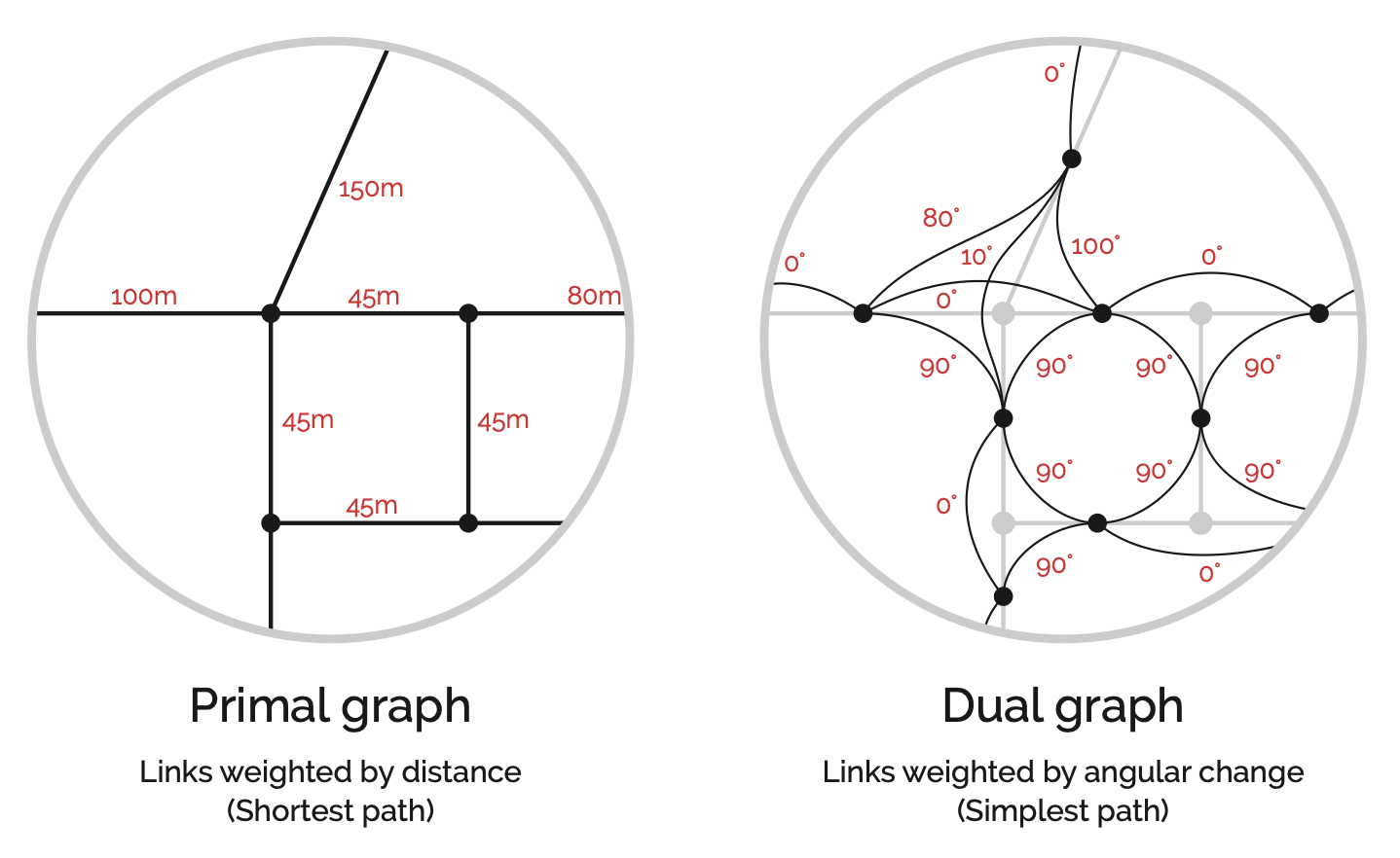
In the primal representation (left), intersections are nodes and streets are links. This is the intuitive way to think about a street network: intersections have coordinates and streets connect them (Porta, Crucitti, and Latora 2006b).
The dual representation (right) inverts this. Nodes sit at the midpoints of street segments, and links represent the angular change (geometric distance) between them, though they can also represent metric distance in metres (Rosvall et al. 2005; Marshall et al. 2018; Batty 2004). Space Syntax emerged around the dual representation (Hillier and Hanson 1984).
Note
Space Syntax methods have changed over time. They originated with the use of so-called axial lines to generate a topological representation of urban space. An axial line is an uninterrupted longest line of sight connecting convex spaces (an area where any two points can be connected by a straight line), potentially spanning multiple contiguous street segments, and distances are topological, meaning the number of steps from axial line to axial line. This is a form of dual representation where the nodes represent street corridors and the links represent the topological steps between them. The techniques for the extrapolation of axial lines from the street network can be complex and variable, historically leading to contentious debates on whether it is possible to do so in an algorithmically rigorous manner (Ratti 2004; Turner and Dalton 2005; Porta, Crucitti, and Latora 2006a). It is important to recognise that newer and more generalisable forms of dual representation have since been widely adopted by the space syntax community: fractional analysis and the now prevalent angular segment analysis (Turner 2000; Dalton 2001; Turner and Dalton 2005, Turner2007) forego axial lines, instead deriving the network from road centre-lines through a direct inversion of the primal representation into its dual, as shown in the Figure.
Cost parameters
Each link in the network can be assigned a cost that represents the “distance” of traversing it. The two main options are:
- Metric distance: physical distance in metres (or time). A 200m street costs twice as much to traverse as a 100m street;
- Geometric distance: angular deviation. A straight route is “shorter” than a winding one, even if the physical distance is greater. Space Syntax favours this metric, based on findings that geometric simplicity influences land use patterns and pedestrian movement (Penn et al. 1998; Hillier et al. 2007; Serra and Hillier 2019).
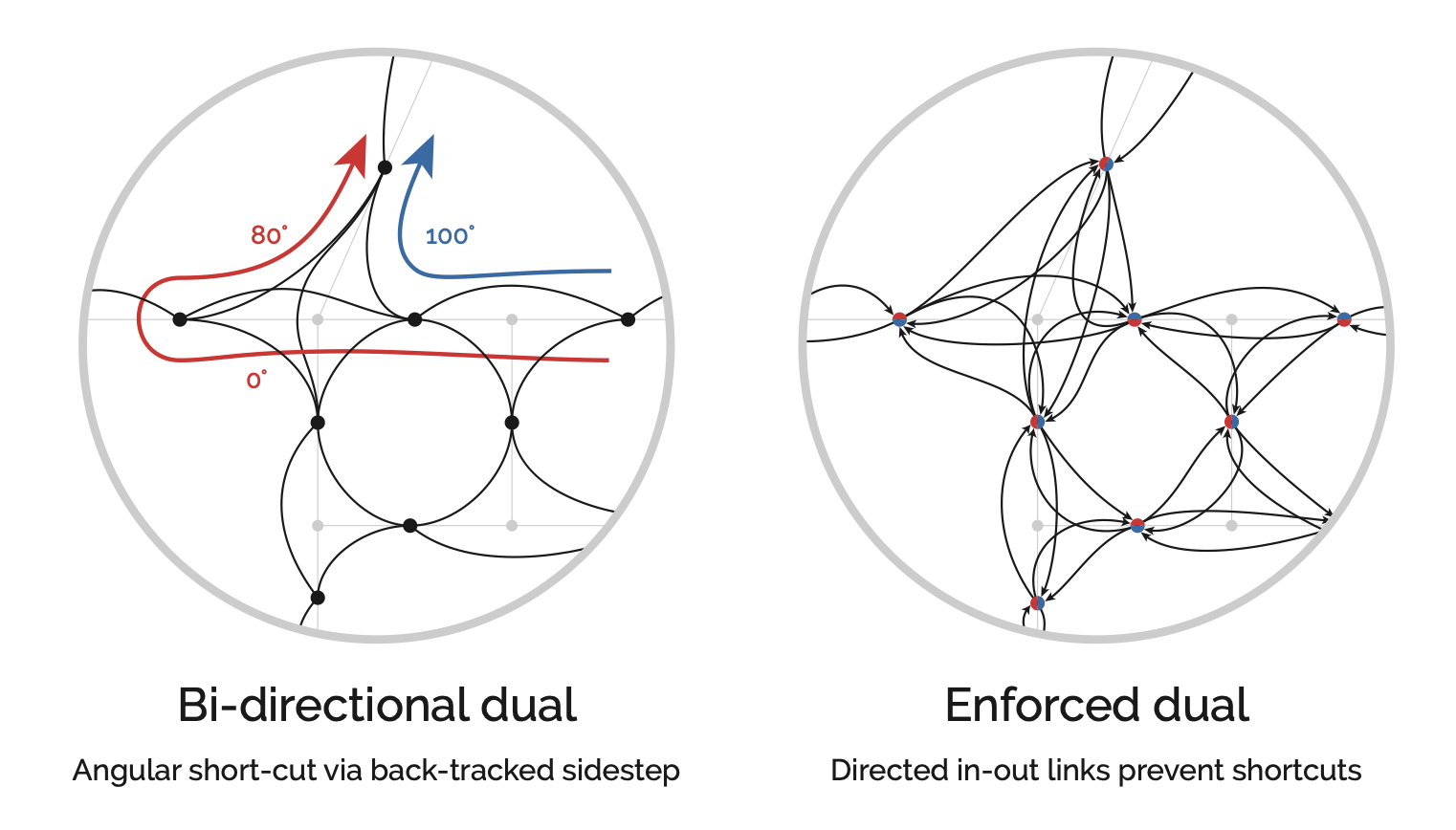
Geometric distance introduces a quirk: shortest-path algorithms can sidestep a sharp turn by combining two shallower adjacent angles instead. To prevent this, the algorithm must enforce in-and-out directions at each node so it continues in the direction it arrived (Turner 2007).
Note
Metric and geometric distance are not mutually exclusive. Both are valid, and their results often overlap: the shortest metric route is frequently also the simplest geometrically (Viana et al. 2013; Omer and Kaplan 2018), with strong correlations at certain distances (Hillier et al. 2007; Serra and Hillier 2019). Pedestrian route choices are varied and context-dependent (Barthelemy 2015), so the two cost parameters are best understood as complementary proxies for different aspects of how people navigate.
Topological distortions
Centrality algorithms are sensitive to the topology of the network. Poor-quality data leads to poor results. Broken links send shortest-path algorithms the wrong way, and overly complex representations of intersections inflate centrality values in the surrounding area.
A common problem is confusing the network’s topology with the geometry of streets. A straight street might be one link between two nodes, but a curved street of the same length is often represented with extra nodes to approximate the curve. Each extra node adds to centrality summations, skewing the results. It is important to use cleaned networks that separate the geometry of the roadway from the topology of the graph. Networks from sources like OpenStreetMap typically need cleaning and simplification before analysis.
Note
cityseer includes automated cleaning workflows that handle many of these issues. For angular (simplest-path) methods or detailed project work, automated cleaning is a good starting point, but manual review of the results is still recommended.
Formulations
Computational packages handle the heavy lifting, but understanding the underlying formulations helps with interpreting results.
Closeness is the reciprocal of farness, where farness is the sum of distances d from node i to all reachable nodes j. Higher closeness means a node is, on average, closer to the rest of the network.
\[ Closeness_{(i)} = \frac{1}{\sum_{j\neq{i}}d_{(i,j)}} \]
\[ Normalised\ Closeness_{(i)} = \frac{N-1}{\sum_{j\neq{i}}d_{(i,j)}} \]
Tip
The sigma symbol (Σ) means summation. Here it means: for a given node i, sum the shortest-path distances to every other node j.
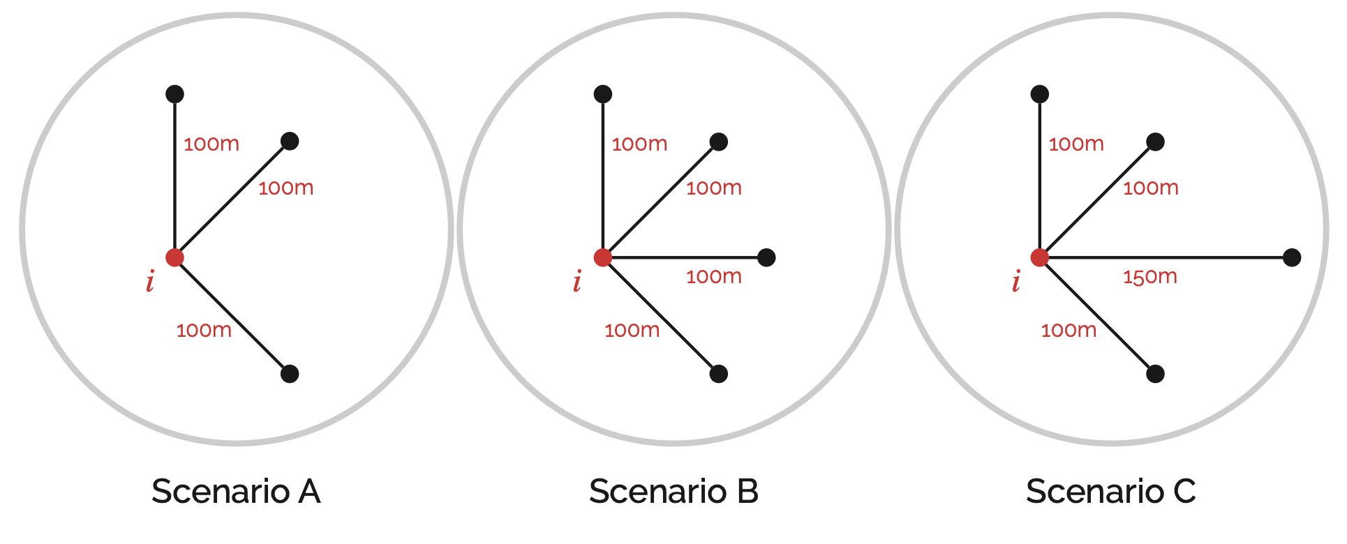
Standard closeness has mathematical quirks when applied to localised analysis. Consider the scenarios in the figure below. Scenario B should have higher closeness than A because it is equally close to more nodes. Scenario C includes a more distant node, so its closeness should be lower than B but still higher than A.
The standard formulation counter-intuitively decreases from A to B, while the normalised form flattens out meaningful differences.
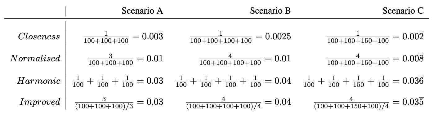
In practice, computational packages use one of these alternative formulations:
- Harmonic Closeness: Where the division happens prior to the summation.
- Improved Closeness: Which divides node counts by the average distance rather than the total distance.
\[ Harmonic\ Closeness_{(i)} = \sum_{j\neq{i}}\frac{1}{d_{(i,j)}} \]
\[ Improved\ Closeness_{(i)} = \frac{N_{i}}{\sum_{j\neq{i}}d_{(i,j)}/{N_{i}}} = \frac{N_{i}^2}{\sum_{j\neq{i}}d_{(i,j)}}. \]
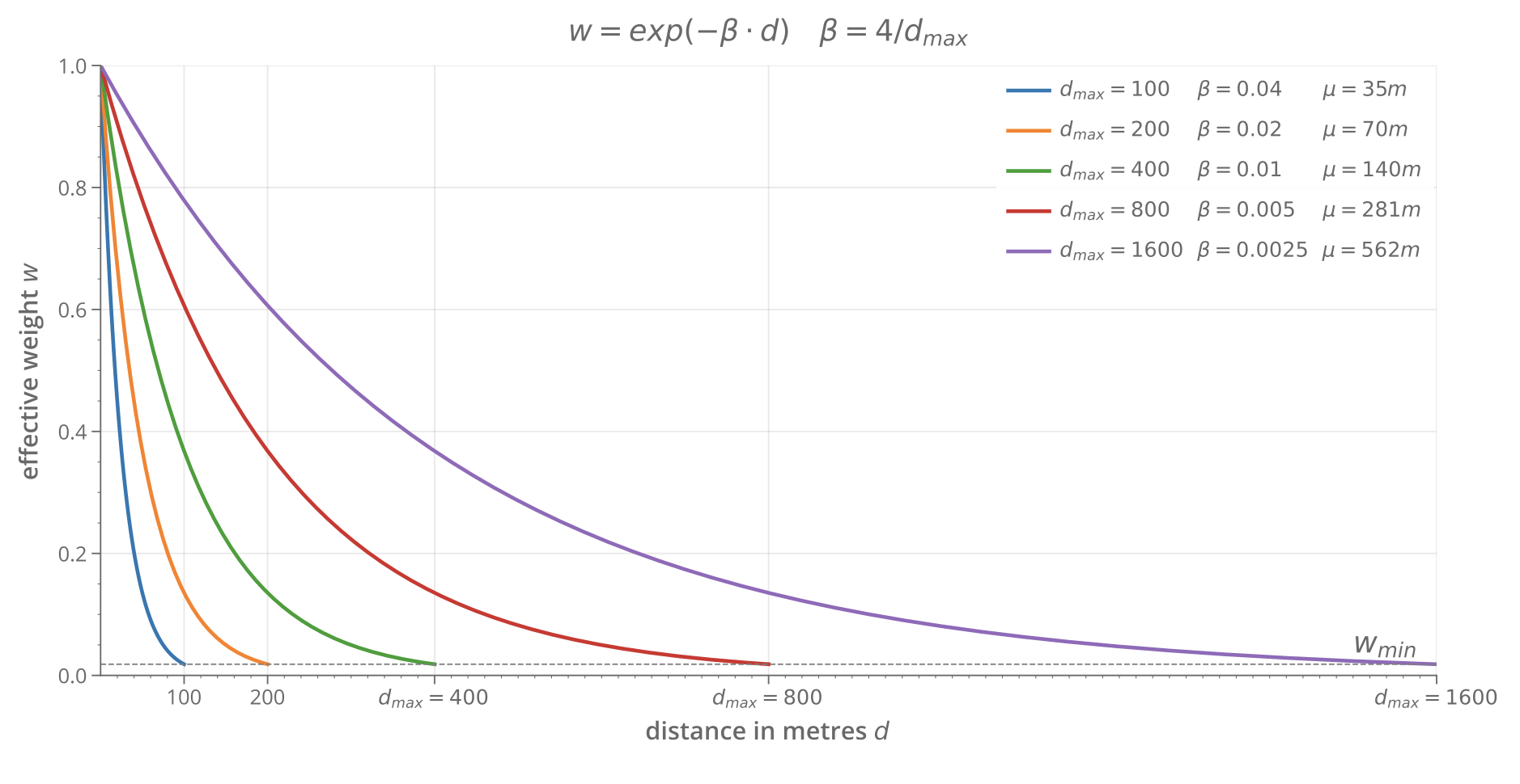
Another approach is the Gravity Index, which measures the potential for spatial interaction. Like gravitational attraction, the potential decays with distance. The rate of decay is controlled by a negative exponential function.
\[ Gravity_{(i)}=\sum_{j\neq{i}}\exp(-\beta\cdot d) \]
Betweenness counts how many shortest paths between all other node pairs pass through the current node. It can also be weighted using the same exponential decay as the Gravity Index. Betweenness is less susceptible to the mathematical quirks that affect closeness.
\[ Betweenness_{(i)} = \sum_{j\neq{i}} \sum_{k\neq{j}\neq{i}} n(j, k)\ i \]
References
© Gareth Simons; The content in this lesson is derived from the following sources:
Challenge Solutions
Solution 1
Print the node with the highest closeness and highest betweenness. In the original graph, A wins both because it connects directly to every other node.
# rebuild the simple graph (in case previous cells modified it)
G2 = nx.Graph()
G2.add_node('A')
G2.add_node('B')
G2.add_node('C')
G2.add_node('D')
G2.add_edge('A', 'B')
G2.add_edge('A', 'C')
G2.add_edge('A', 'D')

close = nx.closeness_centrality(G2)
betw = nx.betweenness_centrality(G2, normalized=False)

max_close = max(close, key=close.get)
max_betw = max(betw, key=betw.get)

print(f"Highest closeness: {max_close} ({close[max_close]:.4f})")
print(f"Highest betweenness: {max_betw} ({betw[max_betw]:.4f})")
Highest closeness: A (1.0000)
Highest betweenness: A (3.0000)Add node E connected to C, and node F connected to D. A is still the most central node, but now C and D also carry some betweenness because shortest paths to the new leaf nodes pass through them.
G2.add_edge('E', 'C')
G2.add_edge('F', 'D')

close = nx.closeness_centrality(G2)
betw = nx.betweenness_centrality(G2, normalized=False)
max_close = max(close, key=close.get)
max_betw = max(betw, key=betw.get)

print(f"Highest closeness: {max_close} ({close[max_close]:.4f})")
print(f"Highest betweenness: {max_betw} ({betw[max_betw]:.4f})")

nx.draw(G2, with_labels=True, node_size=800, font_weight="bold")
Highest closeness: A (0.7143)
Highest betweenness: A (8.0000)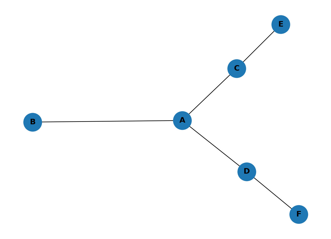
Add a link between E and F, then place a new node G in the middle of A, D, C, E, F and connect it to each. G now rivals A for centrality. With five connections, G is close to most of the network and sits on many shortest paths. The graph has shifted from a single hub to two competing centres.
G2.add_edge('E', 'F')
G2.add_node('G')
for n in ['A', 'D', 'C', 'E', 'F']:
    G2.add_edge('G', n)

close = nx.closeness_centrality(G2)
betw = nx.betweenness_centrality(G2, normalized=False)
max_close = max(close, key=close.get)
max_betw = max(betw, key=betw.get)

print(f"Highest closeness: {max_close} ({close[max_close]:.4f})")
print(f"Highest betweenness: {max_betw} ({betw[max_betw]:.4f})")

nx.draw(G2, with_labels=True, node_size=800, font_weight="bold")
Highest closeness: G (0.8571)
Highest betweenness: A (5.5000)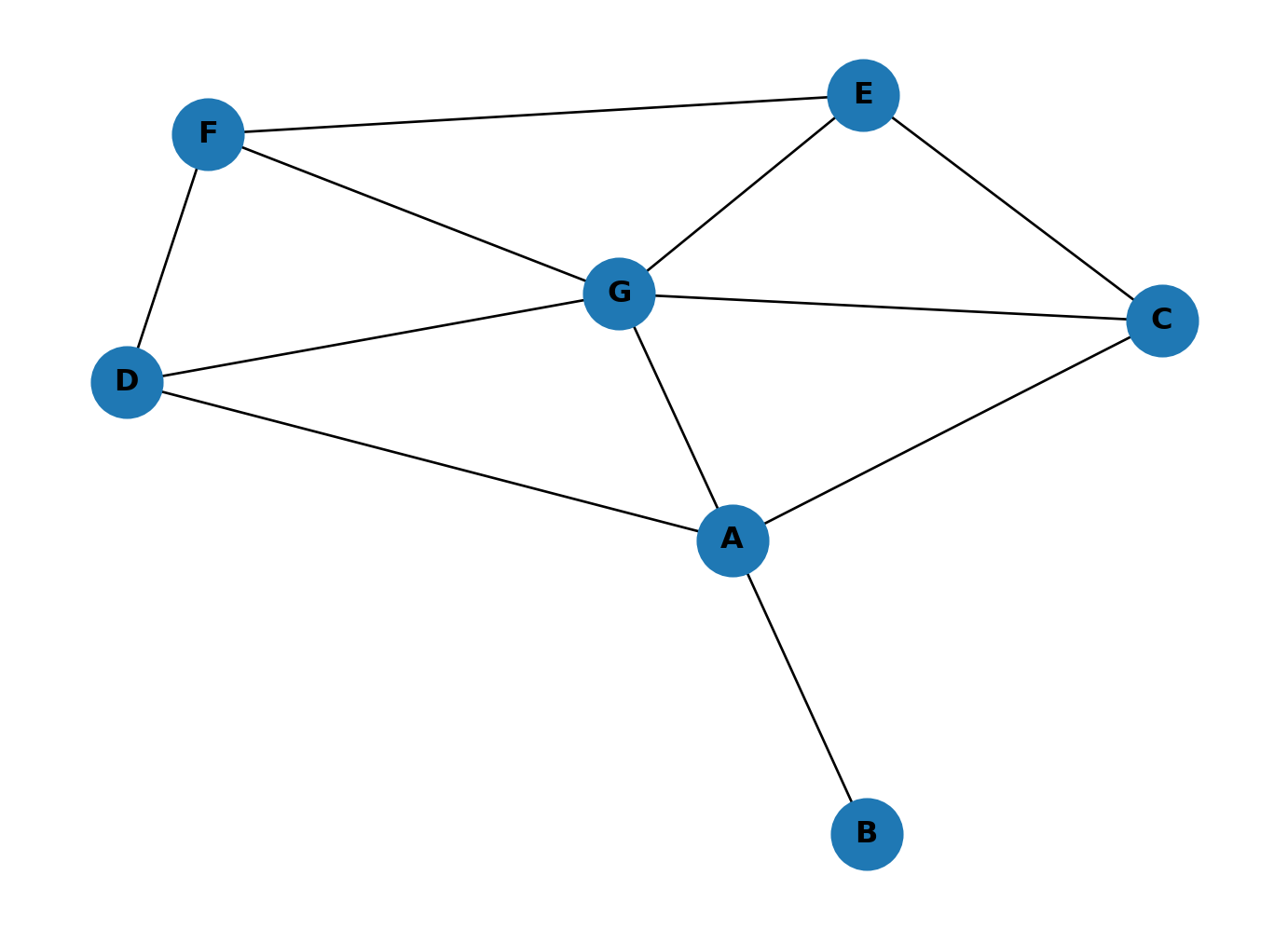
Solution 2
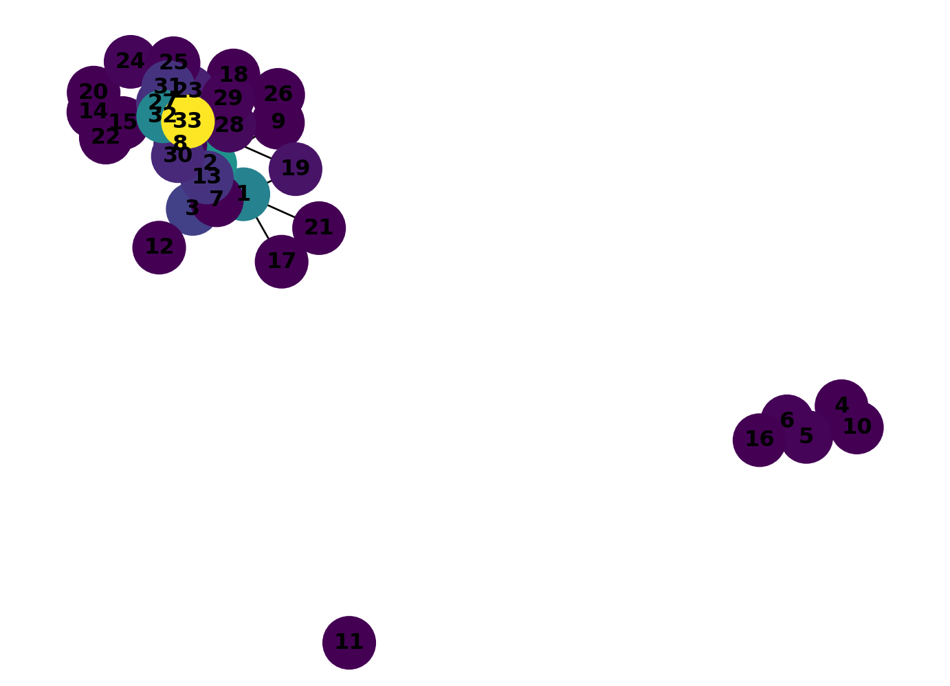
Colour-code the karate club graph by betweenness centrality.
betw_dict = nx.betweenness_centrality(GK, normalized=False)
betw_cols = list(betw_dict.values())
nx.draw(
    GK,
    with_labels=True,
    node_color=betw_cols,
    cmap=plt.cm.viridis,
    node_size=800,
    font_weight="bold"
)
0 wins by a long shot. It sits on far more shortest paths than any other member because it bridges several clusters. Compare this with the closeness plot above: 0 and 33 both scored high on closeness, but betweenness picks out 0 much more strongly. The two measures capture different things: closeness measures how near a node is to everyone else, betweenness measures how much traffic flows through it.
Solution 3
Remove character 0 from the graph:
GK.remove_node(0)Calculate the closeness centrality for the revised graph:
close_dict = nx.closeness_centrality(GK)
close_cols = list(close_dict.values())
nx.draw(
    GK,
    with_labels=True,
    node_color=close_cols,
    cmap=plt.cm.viridis,
    node_size=800,
    font_weight="bold"
)
Calculate the betweenness centrality for the revised graph:
betw_dict = nx.betweenness_centrality(GK, normalized=False)
betw_cols = list(betw_dict.values())
nx.draw(
    GK,
    with_labels=True,
    node_color=betw_cols,
    cmap=plt.cm.viridis,
    node_size=800,
    font_weight="bold"
)
The loss of character 0 has had a significant impact on the network. Character 11 has quit the sport and five others have left to start their own club. The new centrality analysis shows that 33 is now the strong new favourite, the dubious intentions of character 2 have backfired!
Solution 4
Alonso Martinez connects lines 4, 5, and 10. Remove it and see which stations absorb the extra traffic and which lose out.
G_no_am = G_metro.copy()
G_no_am.remove_node("ALONSO MARTINEZ")

betweenness_no_am = nx.betweenness_centrality(G_no_am, normalized=False)
shared = set(betweenness.keys()) & set(betweenness_no_am.keys())
changes = {s: betweenness_no_am[s] - betweenness[s] for s in shared}
top_gains = sorted(changes.items(), key=lambda x: x[1], reverse=True)[:5]
top_losses = sorted(changes.items(), key=lambda x: x[1])[:5]
print("Stations gaining the most betweenness:")
for station, delta in top_gains:
print(f" {station}: +{delta:.1f}")
print("\nStations losing the most betweenness:")
for station, delta in top_losses:
print(f" {station}: {delta:.1f}")Stations gaining the most betweenness:
QUEVEDO: +3398.6
CANAL: +3391.8
SAN BERNARDO: +3051.1
ARGÜELLES: +3022.3
CUATRO CAMINOS: +2438.6
Stations losing the most betweenness:
TRIBUNAL: -4488.2
PLAZA DE ESPAÑA: -4053.2
GREGORIO MARAÑON: -3753.4
GRAN VIA: -1095.1
RUBEN DARIO: -980.0The stations that gain the most are the neighbouring interchanges that pick up Alonso Martinez’s role as a connector between lines. Stations that lose betweenness are those that previously benefited from shortest paths routed through Alonso Martinez: without it, those paths reroute elsewhere, bypassing them entirely.
References
Arcaute, Elsa, Carlos Molinero, Erez Hatna, Roberto Murcio, Camilo Vargas-Ruiz, A Paolo Masucci, and Michael Batty. 2016. “Cities and Regions in Britain Through Hierarchical Percolation.” Royal Society Open Science 3. https://doi.org/10.1098/rsos.150691.
Barthelemy, Marc. 2015. “From Paths to Blocks: New Measures for Street Patterns.” Environment and Planning B: Urban Analytics and City Science 44 (2): 256–71. https://doi.org/10.1177/0265813515599982.
Batty, Michael. 2004. “Distance in Space Syntax.” Working Paper Series 04 (04): 32. www.casa.ucl.ac.uk.
Dalton, Nick. 2001. “Fractional Configurational Analysis And a Solution to the Manhattan Problem.” In 3rd International Space Syntax Symposium. Atlanta.
Freeman, Linton C. 1977. “A Set of Measures of Centrality Based on Betweenness.” Sociometry 40 (1): 35–41. http://www.jstor.org/stable/3033543.
Hillier, Bill, and Julienne Hanson. 1984. The Social Logic of Space. Cambridge: Cambridge University Press.
Hillier, Bill, Alasdair Turner, Tao Yang, and Hoon-Tae Park. 2007. “METRIC AND TOPO-GEOMETRIC PROPERTIES OF URBAN STREET NETWORKS.” In Proceedings, 6th International Space Syntax Symposium. Istanbul.
Marshall, Stephen, Jorge Gil, Karl Kropf, Martin Tomko, and Lucas Figueiredo. 2018. “Street Network Studies: From Networks to Models and Their Representations.” Networks and Spatial Economics. https://doi.org/10.1007/s11067-018-9427-9.
Omer, Itzhak, and Nir Kaplan. 2018. “Structural Properties of the Angular and Metric Street Network’s Centralities and Their Implications for Movement Flows.” Environment and Planning B: Urban Analytics and City Science 46 (6): 1182–1200. https://doi.org/10.1177/2399808318760571.
Penn, A, B Hillier, D Banister, and J Xu. 1998. “Configurational Modelling of Urban Movement Networks.” Environment and Planning B: Planning and Design 25: 59–84.
Porta, Sergio, Paolo Crucitti, and Vito Latora. 2006a. “The Network Analysis of Urban Streets: A Dual Approach.” Physica A 369: 853–66. https://doi.org/10.1016/j.physa.2005.12.063.
———. 2006b. “The Network Analysis of Urban Streets: A Primal Approach.” Environment and Planning B: Planning and Design 33 (5): 705–25. https://doi.org/10.1068/b32045.
Porta, Sergio, Emanuele Strano, Valentino Iacoviello, Roberto Messora, Vito Latora, Alessio Cardillo, Fahui Wang, and Salvatore Scellato. 2009. “Street Centrality and Densities of Retail and Services in Bologna, Italy.” Environment and Planning B: Planning and Design 36 (3): 450–65. https://doi.org/10.1068/b34098.
Ratti, Carlo. 2004. “Space Syntax: Some Inconsistencies.” Environment and Planning B: Planning and Design 31: 487–99. https://doi.org/10.1068/b3019.
Rosvall, M, A Trusina, P Minnhagen, and K Sneppen. 2005. “Networks and Cities: An Information Perspective.” Physical Review Letters 94. https://doi.org/10.1103/PhysRevLett.94.028701.
Sabidussi, Gert. 1966. “The Centrality Index of a Graph.” Psychometrika 31 (4): 581–603.
Serra, Miguel, and Bill Hillier. 2019. “Angular and Metric Distance in Road Network Analysis: A Nationwide Correlation Study.” Computers, Environment and Urban Systems. https://doi.org/10.1016/j.compenvurbsys.2018.11.003.
Shimbel, Alfonso. 1953. “Structural Parameters of Communication Networks.” Bulletin of Mathematical Physics 15: 501–7.
Turner, Alasdair. 2000. “Angular Analysis: A Method for the Quantification of Space.” London: UCL Centre For Advanced Spatial Analysis. http://www.casa.ucl.ac.uk.
———. 2007. “From Axial to Road-Centre Lines: A New Representation for Space Syntax and a New Model of Route Choice for Transport Network Analysis.” Environment and Planning B: Planning and Design 34: 539–55. https://doi.org/10.1068/b32067.
Turner, Alasdair, and Nick Dalton. 2005. “A Simplified Route Choice Model Using the Shortest Angular Path Assumption.” London: Bartlett School of Graduate Studies, University College London.
Van Nes, Akkelies, and Claudia Yamu. 2021. Introduction to Space Syntax in Urban Studies. Cham: Springer International Publishing. https://doi.org/10.1007/978-3-030-59140-3.
Viana, Matheus P, Emanuele Strano, Patricia Bordin, and Marc Barthelemy. 2013. “The Simplicity of Planar Networks.” Scientific Reports 3 (3495). https://doi.org/10.1038/srep03495.
Wasserman, Stanley, and Katherine Faust. 1994. Social Network Analysis. Cambridge: Cambridge University Press.